27 posts tagged “visualization”
2025
My review of Claude’s new Code Interpreter, released under a very confusing name
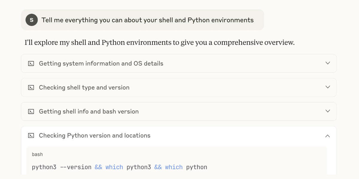
Today on the Anthropic blog: Claude can now create and edit files:
[... 2,771 words]Recreating the Apollo AI adoption rate chart with GPT-5, Python and Pyodide
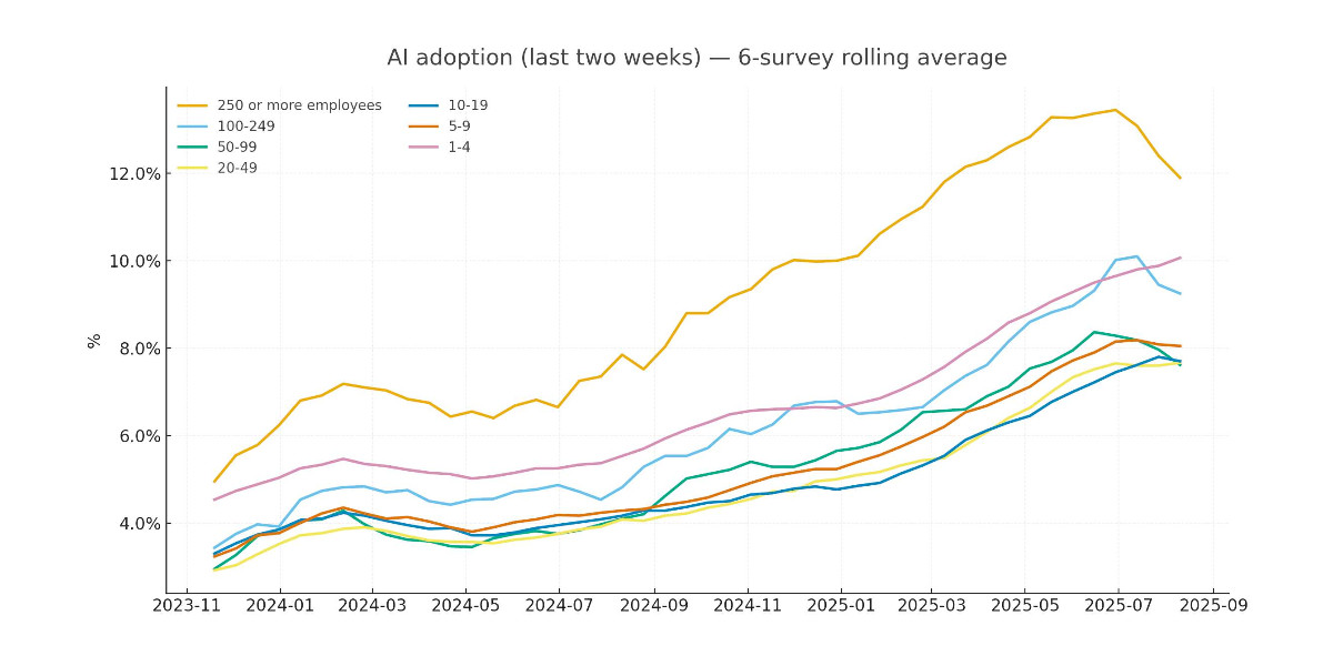
Apollo Global Management’s “Chief Economist” Dr. Torsten Sløk released this interesting chart which appears to show a slowdown in AI adoption rates among large (>250 employees) companies:
[... 2,673 words]python-importtime-graph.
I was exploring why a Python tool was taking over a second to start running and I learned about the python -X importtime feature, documented here. Adding that option causes Python to spit out a text tree showing the time spent importing every module.
I tried that like this:
python -X importtime -m llm plugins
That's for LLM running 41 different plugins. Here's the full output from that command, which starts like this:
import time: self [us] | cumulative | imported package
import time:        77 |         77 |   _io
import time:        19 |         19 |   marshal
import time:       131 |        131 |   posix
import time:       363 |        590 | _frozen_importlib_external
import time:       450 |        450 |   time
import time:       110 |        559 | zipimport
import time:        64 |         64 |     _codecs
import time:       252 |        315 |   codecs
import time:       277 |        277 |   encodings.aliases
Kevin Michel built this excellent tool for visualizing these traces as a treemap. It runs in a browser - visit kmichel.github.io/python-importtime-graph/ and paste in the trace to get the visualization.
Here's what I got for that LLM example trace:
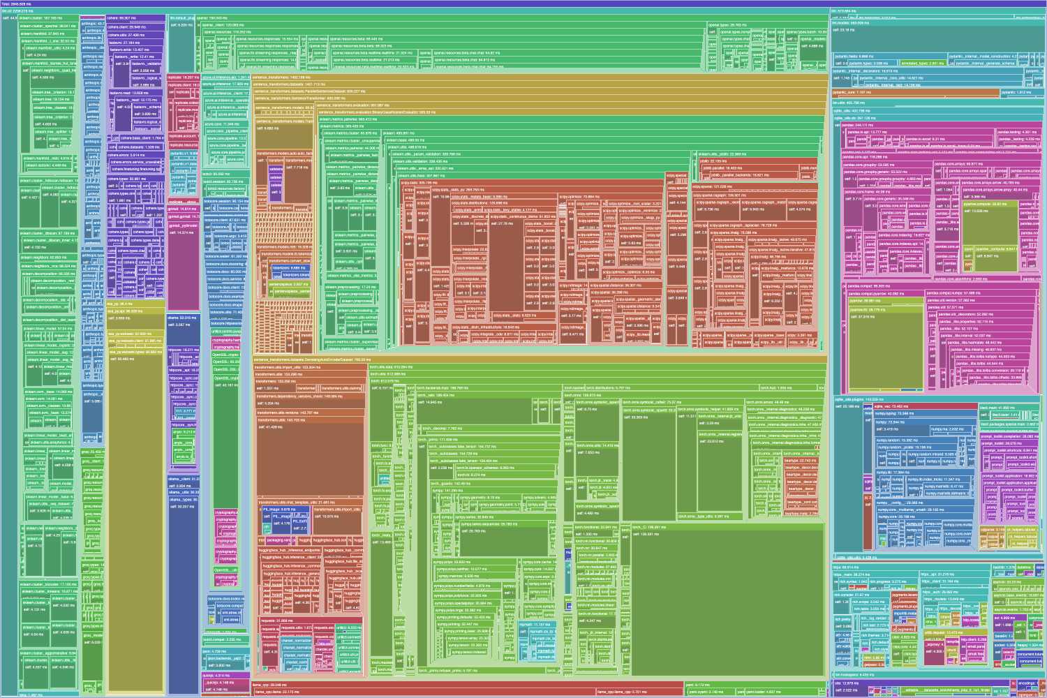
As you can see, it's pretty dense! Here's the SVG version which is a lot more readable, since you can zoom in to individual sections.
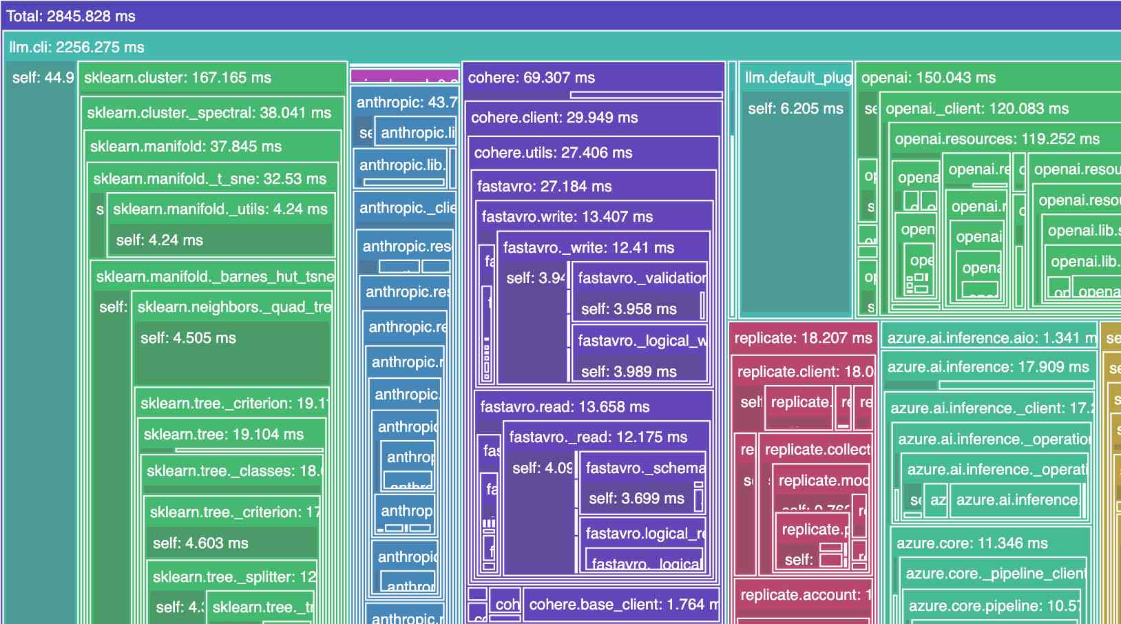
Zooming in it looks like this:
2024
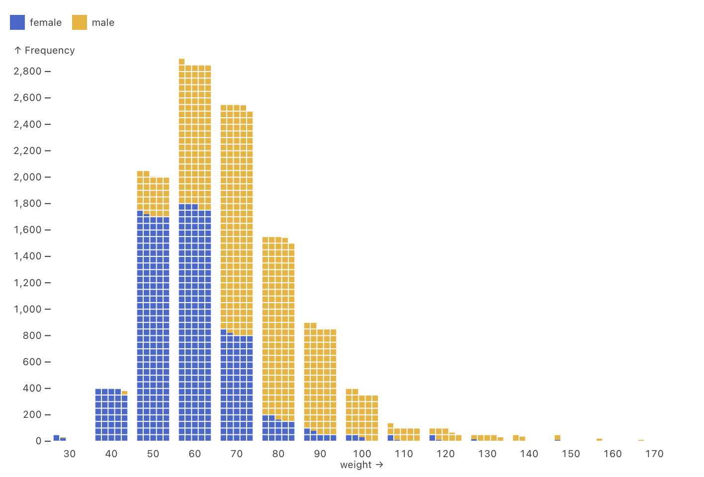
Observable Plot: Waffle mark (via) New feature in Observable Plot 0.6.16: the waffle mark! I really like this one. Here's an example showing the gender and weight of athletes in this year's Olympics:
I’ve stopped using box plots. Should you? (via) Nick Desbarats explains box plots (including with this excellent short YouTube video) and then discusses why he thinks "typically less than 20 percent" of participants in his workshops already understand how to read them.
A key problem is that they are unintuitive: a box plot has four sections, two thin lines (the top and bottom whisker segments) and two larger boxes, joined around the median. Each of these elements represents the same number of samples (one quartile each) but the thin lines v.s. thick boxes imply that the whiskers contain less samples than the boxes.
2023
datasette-plot—a new Datasette Plugin for building data visualizations. I forgot to link to this here last week: Alex Garcia released the first version of datasette-plot, a brand new Datasette visualization plugin built on top of the Observable Plot charting library. We plan to use this as the new, updated alternative to my older datasette-vega plugin.
2022
datasette-dashboards (via) Romain Clement’s datasette-dashboards plugin lets you configure dashboards for Datasette using YAML, combining markdown blocks, Vega graphs and single number metrics using a layout powered by CSS grids. This is a beautiful piece of software design, with a very compelling live demo.
Datasette table diagram using Mermaid (via) Mermaid is a DSL for generating diagrams from plain text, designed to be embedded in Markdown. GitHub just added support for Mermaid to their Markdown pipeline, which inspired me to try it out. Here’s an Observable Notebook I built which uses Mermaid to visualize the relationships between Datasette tables based on their foreign keys.
Observable Plot Cheatsheets (via) Beautiful new set of cheatsheets by Mike Freeman for the Observable Plot charting library. This is really top notch documentation—the cheatsheets are available as printable PDFs but the real value here is in the interactive versions of them, which include Observable-powered sliders to tweak the different examples and copy out the resulting generated code.
2021
Plot & Vega-Lite. Useful documentation comparing the brand new Observable Plot to Vega-Lite, complete with examples of how to achieve the same thing in both libraries.
Observable Plot (via) This is huge: a brand new high-level JavaScript visualization library from Mike Bostock, the author of D3—partially inspired by Vega-Lite which I’ve used enthusiastically in the past. First impressions are that this is a big step forward for quickly building high-quality visualizations. It’s released under the ISC license which is “functionally equivalent to the BSD 2-Clause and MIT licenses”.
2020
Weeknotes: datasette-seaborn, fivethirtyeight-polls
This week I released Datasette 0.49 and tinkered with datasette-seaborn, dogsheep-beta and polling data from FiveThirtyEight.
[... 951 words]Datasette table diagram, now with a DOT graph (via) Thomas Ballinger shared a huge improvement to my Observable notebook for rendering a diagram of a collection of Datasette tables. He showed how to use the DOT language to render a full schema digram with arrows joining together the different tables. I’ve applied his changes to my notebook.
2019
Weeknotes: Niche Museums, Kepler, Trees and Streaks
Every now and then someone will ask “so when are you going to build Museums Near Me then?”, based on my obsession with niche museums and websites like www.owlsnearme.com.
[... 872 words]kepler.gl. Uber built this open source geospatial analysis tool for large-scale data sets, and they offer it as a free hosted online tool—just click Get Started on the site. I uploaded two CSV files with 30,000+ latitude/longitude points in them just now and used Kepler to render them as images.
Thematic map—GIS Wiki. This is a really useful wiki full of GIS information, and the coverage of different types of thematic maps is particularly thorough.
Exploring Neural Networks with Activation Atlases. Another promising attempt at visualizing what’s going on inside a neural network.
List of Physical Visualizations (via) “A chronological list of physical visualizations and related artifacts, maintained by Pierre Dragicevic and Yvonne Jansen”—327 and counting!
2018
datasette-vega (via) I wrote a visualization plugin for Datasette that uses the excellent Vega “visualization grammar” library to provide bar, line and scatter charts configurable against any Datasette table or SQL query.
Datasette plugins, and building a clustered map visualization
Datasette now supports plugins!
[... 751 words]Visualizing disk IO activity using log-scale banded graphs (via) This is a neat data visualization trick: to display rates of disk I/O, it splits the rate into a GB, MB and KB section on a stacked chart. This means that if you are getting jitter in the order of KBs even while running at 400+MB/second you can see the jitter in the KB section.
Vega-Lite. A “high-level grammar of interactive graphics”. Part of the Vega project, which provides a mechanism for creating declarative visualizations by defining them using JSON. Vega-Lite is particularly interesting to me because it makes extremely tasteful decisions about how data should be visualized—give it some records, tell it which properties to plot on an axis and it will default to a display that makes sense for that data. The more I play with this the more impressed I am at the quality of its default settings.
Observable: An Earthquake Globe in Ten Minutes. Well worth your time. Jeremy Ashkenas uses Observable to live-code an interactive visualization of recent earthquakes around the world, using USGS data (fetched as JSON), d3, topoJSON and an Observable notebook. I’m sold—this is truly ground-breaking new technology.
2017
Exploring Line Lengths in Python Packages. Interesting exploration of the impact if the 79 character length limit rule of thumb on various Python packages—and a thoroughly useful guide to histogram plotting in Jupyter, pandas and matplotlib.
2016
Generating interactive HTML charts from Python?
D3 is absolutely amazing but the learning curve is a bit steep. Totally worth the effort to learn it in the long run, but it’s not so useful if you want to get something done quickly.
[... 97 words]2008
Visualization Strategies: Text & Documents. “List of ...” style posts usually make me want to stab someone with a fork; this is how that kind of post should be done—well researched, carefully written and, most importantly doesn’t call itself a “Top X Ys that will Z your ZZ”!
2007
Designing Google Reader’s trends. “But beyond the visualization, this serves as a good example of collecting and understanding the ambient information that flows through our digital lives.”