83 posts tagged “design”
2026
Don’t “Trust the Process” (via) Jenny Wen, Design Lead at Anthropic (and previously Director of Design at Figma) gave a provocative keynote at Hatch Conference in Berlin last September.
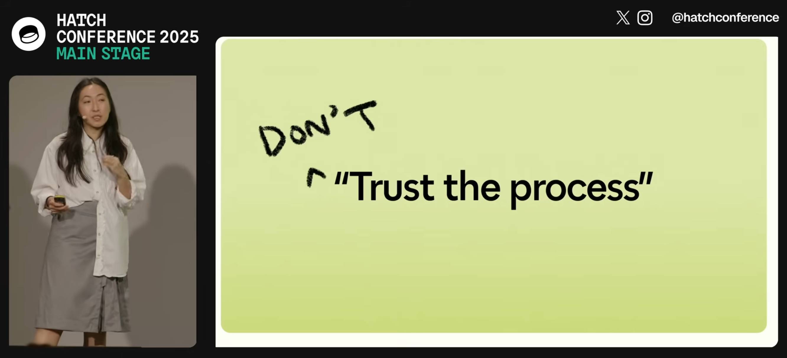
Jenny argues that the Design Process - user research leading to personas leading to user journeys leading to wireframes... all before anything gets built - may be outdated for today's world.
Hypothesis: In a world where anyone can make anything — what matters is your ability to choose and curate what you make.
In place of the Process, designers should lean into prototypes. AI makes these much more accessible and less time-consuming than they used to be.
Watching this talk made me think about how AI-assisted programming significantly reduces the cost of building the wrong thing. Previously if the design wasn't right you could waste months of development time building in the wrong direction, which was a very expensive mistake. If a wrong direction wastes just a few days instead we can take more risks and be much more proactive in exploring the problem space.
I've always been a compulsive prototyper though, so this is very much playing into my own existing biases!
It’s hard to justify Tahoe icons (via) Devastating critique of the new menu icons in macOS Tahoe by Nikita Prokopov, who starts by quoting the 1992 Apple HIG rule to not "overload the user with complex icons" and then provides comprehensive evidence of Tahoe doing exactly that.
In my opinion, Apple took on an impossible task: to add an icon to every menu item. There are just not enough good metaphors to do something like that.
But even if there were, the premise itself is questionable: if everything has an icon, it doesn’t mean users will find what they are looking for faster.
And even if the premise was solid, I still wish I could say: they did the best they could, given the goal. But that’s not true either: they did a poor job consistently applying the metaphors and designing the icons themselves.
2025
I've never been particularly invested dark v.s. light mode but I get enough people complaining that this site is "blinding" that I decided to see if Claude Code for web could produce a useful dark mode from my existing CSS. It did a decent job, using CSS properties, @media (prefers-color-scheme: dark) and a data-theme="dark" attribute based on this prompt:
Add a dark theme which is triggered by user media preferences but can also be switched on using localStorage - then put a little icon in the footer for toggling it between default auto, forced regular and forced dark mode
The site defaults to picking up the user's preferences, but there's also a toggle in the footer which switches between auto, forced-light and forced-dark. Here's an animated demo:
I had Claude Code make me that GIF from two static screenshots - it used this ImageMagick recipe:
magick -delay 300 -loop 0 one.png two.png \
    -colors 128 -layers Optimize dark-mode.gif
The CSS ended up with some duplication due to the need to handle both the media preference and the explicit user selection. We fixed that with Cog.
The ChatGPT sharing dialog demonstrates how difficult it is to design privacy preferences
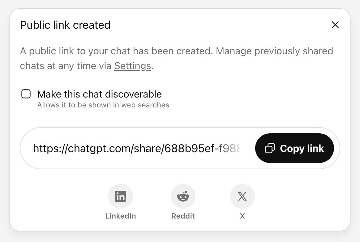
ChatGPT just removed their “make this chat discoverable” sharing feature, after it turned out a material volume of users had inadvertantly made their private chats available via Google search.
[... 999 words]Re-label the “Save” button to be “Publish”, to better indicate to users the outcomes of their action (via) Fascinating Wikipedia usability improvement issue from 2016:
From feedback we get repeatedly as a development team from interviews, user testing and other solicited and unsolicited avenues, and by inspection from the number of edits by newbies not quite aware of the impact of their edits in terms of immediate broadcast and irrevocability, that new users don't necessarily understand what "Save" on the edit page means. [...]
Even though "user-generated content" sites are a lot more common today than they were when Wikipedia was founded, it is still unusual for most people that their actions will result in immediate, and effectively irrevocable, publication.
A great illustration of the usability impact of micro-copy, even more important when operating at Wikipedia scale.
Enough AI copilots! We need AI HUDs. Geoffrey Litt compares Copilots - AI assistants that you engage in dialog with and work with you to complete a task - with HUDs, Head-Up Displays, which enhance your working environment in less intrusive ways.
He uses spellcheck as an obvious example, providing underlines for incorrectly spelt words, and then suggests his AI-implemented custom debugging UI as a more ambitious implementation of that pattern.
Plenty of people have expressed interest in LLM-backed interfaces that go beyond chat or editor autocomplete. I think HUDs offer a really interesting way to frame one approach to that design challenge.
2024
RISD BFA Industrial Design: AI Software Design Studio. Fascinating syllabus for a course on digital product design taught at the Rhode Island School of Design by Kelin Carolyn Zhang.
Designers must adapt and shape the frontier of AI-driven computing — while navigating the opportunities, risks, and ethical responsibilities of working with this new technology.
In this new world, creation is cheap, craft is automatable, and everyone is a beginner. The ultimate differentiator will be the creator’s perspective, taste, and judgment. The software design education for our current moment must prioritize this above all else.
By course's end, students will have hands-on experience with an end-to-end digital product design process, culminating in a physical or digital product that takes advantage of the unique properties of generative AI models. Prior coding experience is not required, but students will learn using AI coding assistants like ChatGPT and Claude.
From Kelin's Twitter thread about the course so far:
these are juniors in industrial design. about half of them don't have past experience even designing software or using figma [...]
to me, they're doing great because they're moving super quickly
what my 4th yr interaction design students in 2019 could make in half a semester, these 3rd year industrial design students are doing in a few days with no past experience [...]
they very quickly realized the limits of LLM code in week 1, especially in styling & creating unconventional behavior
AI can help them make a functional prototype with js in minutes, but it doesn't look good
Help wanted: AI designers (via) Nick Hobbs:
LLMs feel like genuine magic. Yet, somehow we haven’t been able to use this amazing new wand to churn out amazing new products. This is puzzling.
Why is it proving so difficult to build mass-market appeal products on top of this weird and powerful new substrate?
Nick thinks we need a new discipline - an AI designer (which feels to me like the design counterpart to an AI engineer). Here's Nick's list of skills they need to develop:
- Just like designers have to know their users, this new person needs to know the new alien they’re partnering with. That means they need to be just as obsessed about hanging out with models as they are with talking to users.
- The only way to really understand how we want the model to behave in our application is to build a bunch of prototypes that demonstrate different model behaviors. This — and a need to have good intuition for the possible — means this person needs enough technical fluency to look kind of like an engineer.
- Each of the behaviors you’re trying to design have near limitless possibility that you have to wrangle into a single, shippable product, and there’s little to no prior art to draft off of. That means this person needs experience facing the kind of “blank page” existential ambiguity that founders encounter.
Sometimes the most creativity is found in enumerating the solution space. Design is the process of prioritizing tradeoffs in a high dimensional space. Understand that dimensionality.
Lateral Thinking with Withered Technology. Gunpei Yokoi’s product design philosophy at Nintendo (“Withered” is also sometimes translated as “Weathered”). Use “mature technology that can be mass-produced cheaply”, then apply lateral thinking to find radical new ways to use it.
This has echos for me of Dan McKinley’s “Choose Boring Technology”, which argues that in software projects you should default to a proven, stable stack so you can focus your innovation tokens on the problems that are unique to your project.
2023
New Default: Underlined Links for Improved Accessibility (GitHub Blog). “By default, links within text blocks on GitHub are now underlined. This ensures links are easily distinguishable from surrounding text.”
ChatGPT should include inline tips
In OpenAI isn’t doing enough to make ChatGPT’s limitations clear James Vincent argues that OpenAI’s existing warnings about ChatGPT’s confounding ability to convincingly make stuff up are not effective.
[... 1,488 words]Why Chatbots Are Not the Future. Amelia Wattenberger makes a convincing argument for why chatbots are a terrible interface for LLMs. “Good tools make it clear how they should be used. And more importantly, how they should not be used.”
2021
brumm.af/shadows (via) I did not know this trick: by defining multiple box-shadow values as a comma separated list you can create much more finely tuned shadow effects. This tool by Philipp Brumm provides a very smart UI for designing shadows.
2020
Command Line Interface Guidelines (via) Aanand Prasad, Ben Firshman, Carl Tashian and Eva Parish provide the missing manual for designing CLI tools in 2020. Deeply researched and clearly presented—I picked up a bunch of useful tips and ideas from reading this, and I’m looking forward to applying them to my own CLI projects.
Weeknotes: datasette-auth-passwords, a Datasette logo and a whole lot more
All sorts of project updates this week.
[... 913 words]So next time someone is giving you feedback about something you made, think to yourself that to win means getting two or three insights, ideas, or suggestions that you are excited about, and that you couldn’t think up on your own.
2018
Whether you like it or not, whether you approve it or not, people outside of your design team are making significant design choices that affect your customers in important ways. They are designing your product. They are designers.
2017
Work process vs technology
Do you have a plan for what happens if you lose your hard drive, or someone steals it? I understand your need for offline access, but personally I’m terrified of losing my laptop to the point that I use cloud backup services (Dropbox, but I’ve used and liked Backblaze in the past) to make absolutely sure that I don’t lose any data should my laptop get lost or stolen.
[... 81 words]2013
What design techniques does Apple use in the introduction page of iPad Air?
Apple used the same technique on their Apple—Mac Pro page. I first saw this trick used on the BeerCamp at SXSW 2011 page.
[... 91 words]How long should I budget for an experienced designer to design a responsive ecommerce store?
There’s no single answer to this—it depends on the scope of the project. A one-page store selling 3 items is quicker to design than a thousand page store with dozens of category homepages etc.
[... 87 words]What are the best web design and web development conferences/ meetups in Central & Eastern Europe (2013)?
We have a list of Web Design conferences and events in Central and Eastern Europe on Lanyrd—you might find our full list of Conferences in Central and Eastern Europe useful as well.
[... 94 words]Where can I find out about upcoming conferences, conventions, and trade shows in design, publishing, and elearning?
Our site, Lanyrd, is a crowdsourced directory of conferences and professional events. We’re extremely strong in areas such as Mobile, Web Design and User Experience, but we also have listings for Publishing and E-Learning. Try these pages:
[... 162 words]What would be the best design conference to attend in 2013?
That’s a pretty tricky question to answer... there are a lot of excellent UX conferences around (we’re listing 69 upcoming UX events on Lanyrd at the moment, and more get added frequently). A few things you should consider:
[... 198 words]2012
Which sites have the best URL design?
GitHub’s URL design is fantastic—it’s a virtually flawless mapping of Git semantics to URL space. Their basic URL structure is excellent, but they also have a bunch of neat URL hacks going on. Here are a few of my favourites:
[... 97 words]What is the best design conference in the midwest?
If you’re looking for a general UX/web design event, the An Event Apart series are excellent—they tour various American cities including Chicago from August 27-29. http://aneventapart.com/2012/chi...
[... 140 words]2011
What are the best design conferences or meetups in Switzerland?
I haven’t been myself, but Lift has an excellent reputation:
[... 30 words]What are the best free resources to begin learning UX design?
We’re collecting videos and slides from conference sessions covering user experience on Lanyrd—here’s 10 videos and 14 slide decks:
[... 42 words]2010
24 ways: Extreme Design. Hannah Donovan on the design process that has evolved from multiple /dev/fort expeditions.
What are the underlying, unspoken values of TED?
Not unspoken, but the ten commandments they send out to their speakers are pretty interesting: http://www.ted.com/pages/360
[... 31 words]