98 posts tagged “usability”
2026
Please, please, please stop using passkeys for encrypting user data (via) Because users lose their passkeys all the time, and may not understand that their data has been irreversibly encrypted using them and can no longer be recovered.
Tim Cappalli:
To the wider identity industry: please stop promoting and using passkeys to encrypt user data. I’m begging you. Let them be great, phishing-resistant authentication credentials.
It’s hard to justify Tahoe icons (via) Devastating critique of the new menu icons in macOS Tahoe by Nikita Prokopov, who starts by quoting the 1992 Apple HIG rule to not "overload the user with complex icons" and then provides comprehensive evidence of Tahoe doing exactly that.
In my opinion, Apple took on an impossible task: to add an icon to every menu item. There are just not enough good metaphors to do something like that.
But even if there were, the premise itself is questionable: if everything has an icon, it doesn’t mean users will find what they are looking for faster.
And even if the premise was solid, I still wish I could say: they did the best they could, given the goal. But that’s not true either: they did a poor job consistently applying the metaphors and designing the icons themselves.
2025
The ChatGPT sharing dialog demonstrates how difficult it is to design privacy preferences
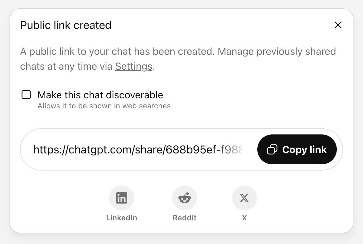
ChatGPT just removed their “make this chat discoverable” sharing feature, after it turned out a material volume of users had inadvertantly made their private chats available via Google search.
[... 999 words]Re-label the “Save” button to be “Publish”, to better indicate to users the outcomes of their action (via) Fascinating Wikipedia usability improvement issue from 2016:
From feedback we get repeatedly as a development team from interviews, user testing and other solicited and unsolicited avenues, and by inspection from the number of edits by newbies not quite aware of the impact of their edits in terms of immediate broadcast and irrevocability, that new users don't necessarily understand what "Save" on the edit page means. [...]
Even though "user-generated content" sites are a lot more common today than they were when Wikipedia was founded, it is still unusual for most people that their actions will result in immediate, and effectively irrevocable, publication.
A great illustration of the usability impact of micro-copy, even more important when operating at Wikipedia scale.
It frustrates me when support sites for online services fail to link to the things they are talking about. Cloudflare's Find zone and account IDs page for example provides a four step process for finding my account ID that starts at the root of their dashboard, including a screenshot of where I should click.
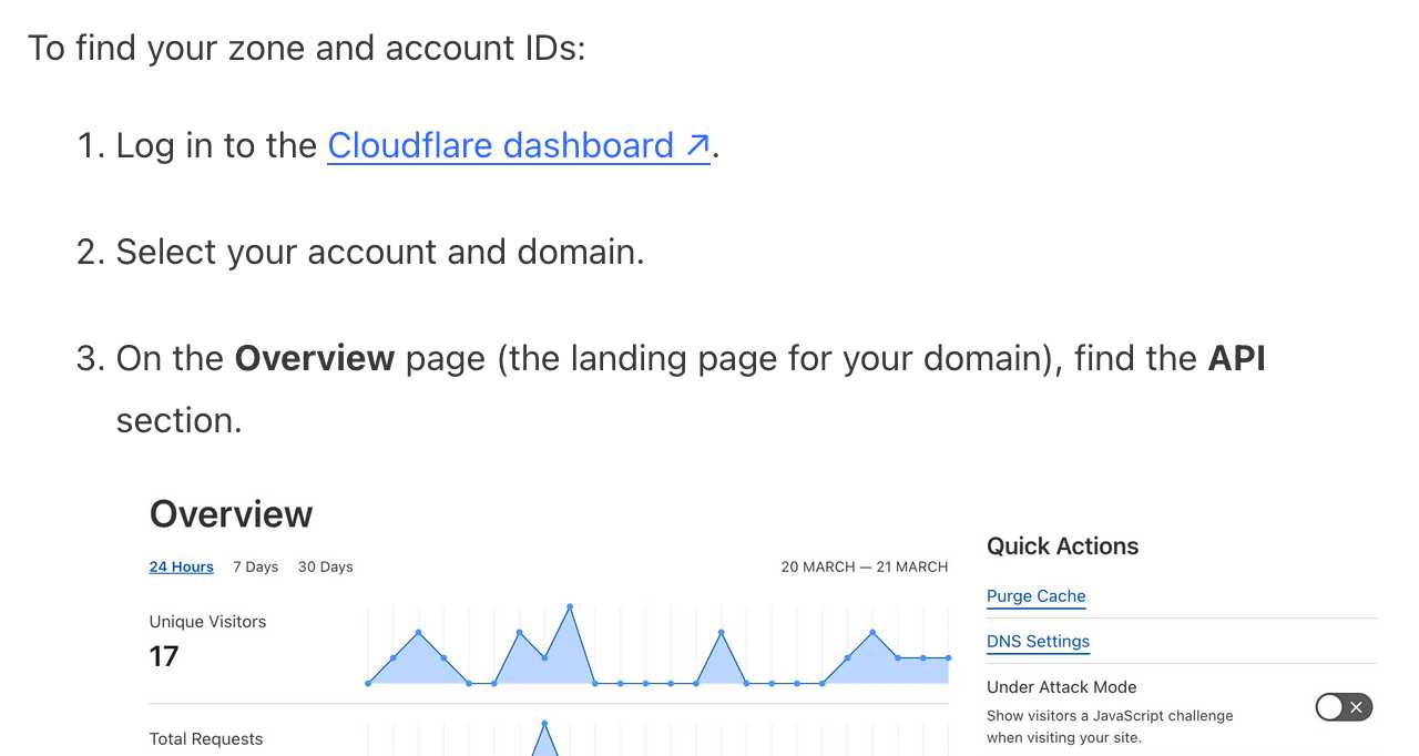
In Cloudflare's case it's harder to link to the correct dashboard page because the URL differs for different users, but that shouldn't be a show-stopper for getting this to work. Set up dash.cloudflare.com/redirects/find-account-id and link to that!
... I just noticed they do have a mechanism like that which they use elsewhere. On the R2 authentication page they link to:
https://dash.cloudflare.com/?to=/:account/r2/api-tokens
The "find account ID" flow presumably can't do the same thing because there is no single page displaying that information - it's shown in a sidebar on the page for each of your Cloudflare domains.
2024
ChatGPT Canvas can make API requests now, but it’s complicated

Today’s 12 Days of OpenAI release concerned ChatGPT Canvas, a new ChatGPT feature that enables ChatGPT to pop open a side panel with a shared editor in it where you can collaborate with ChatGPT on editing a document or writing code.
[... 1,116 words]The problem with passkeys is that they're essentially a halfway house to a password manager, but tied to a specific platform in ways that aren't obvious to a user at all, and liable to easily leave them unable to access of their accounts. [...]
Chrome on Windows stores your passkeys in Windows Hello, so if you sign up for a service on Windows, and you then want to access it on iPhone, you're going to be stuck (unless you're so forward thinking as to add a second passkey, somehow, from the iPhone will on the Windows computer!). The passkey lives on the wrong device, if you're away from the computer and want to login, and it's not at all obvious to most users how they might fix that.
Consumer products have had growth hackers for many years optimizing every part of the onboarding funnel. Dev tools should do the same. Getting started shouldn't be an afterthought after you built the product. Getting started is the product!
And I mean this to the point where I think it's worth restructuring your entire product to enable fast onboarding. Get rid of mandatory config. Make it absurdly easy to set up API tokens. Remove all the friction. Make it possible for users to use your product on their laptop in a couple of minutes, tops.
ChatGPT in “4o” mode is not running the new features yet
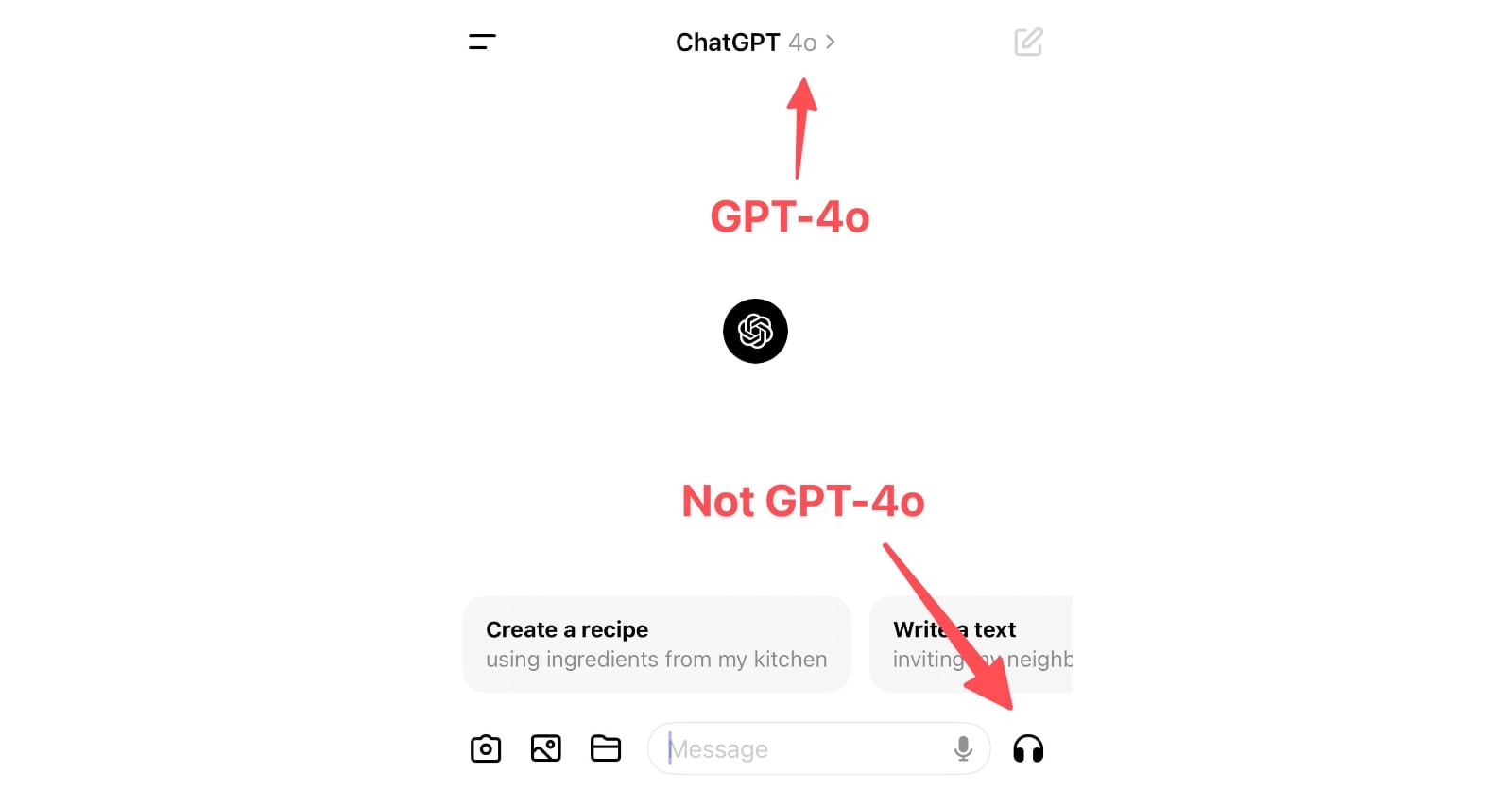
Monday’s OpenAI announcement of their new GPT-4o model included some intriguing new features:
[... 898 words]How do you accidentally run for President of Iceland? (via) Anna Andersen writes about a spectacular user interface design case-study from this year's Icelandic presidential election.
Running for President requires 1,500 endorsements. This year, those endorsements can be filed online through a government website.
The page for collecting endorsements originally had two sections - one for registering to collect endorsements, and another to submit your endorsement. The login link for the first came higher on the page, and at least 11 people ended up accidentally running for President!
A bad survey won’t tell you it’s bad. It’s actually really hard to find out that a bad survey is bad — or to tell whether you have written a good or bad set of questions. Bad code will have bugs. A bad interface design will fail a usability test. It’s possible to tell whether you are having a bad user interview right away. Feedback from a bad survey can only come in the form of a second source of information contradicting your analysis of the survey results.
Most seductively, surveys yield responses that are easy to count and counting things feels so certain and objective and truthful.
Even if you are counting lies.
The language issues are indicative of the bigger problem facing the AI Pin, ChatGPT, and frankly, every other AI product out there: you can’t see how it works, so it’s impossible to figure out how to use it. [...] our phones are constant feedback machines — colored buttons telling us what to tap, instant activity every time we touch or pinch or scroll. You can see your options and what happens when you pick one. With AI, you don’t get any of that. Using the AI Pin feels like wishing on a star: you just close your eyes and hope for the best. Most of the time, nothing happens.
The Articulation Barrier: Prompt-Driven AI UX Hurts Usability. Jakob Nielsen: “Generative AI systems like ChatGPT use prose prompts for intent-based outcomes, requiring users to be articulate in writing prose, which is a challenge for half of the population in rich countries.”
If you have had any prior experience with personal computers, what you might expect to see is some sort of opaque code, called a “prompt,” consisting of phosphorescent green or white letters on a murky background. What you see with Macintosh is the Finder. On a pleasant, light background (you can later change the background to any of a number of patterns, if you like), little pictures called “icons” appear, representing choices available to you.
— Steven Levy, in 1984
The Eight Golden Rules of Interface Design (via) By HCI researcher Ben Shneiderman. I particularly like number 4, “Design dialogs to yield closure”, which encourages feedback at the completion of a group of actions that “gives users the satisfaction of accomplishment, a sense of relief.”
2023
The 6 Types of Conversations with Generative AI. I’ve hoping to see more user research on how users interact with LLMs for a while. Here’s a study from Nielsen Norman Group, who conducted a 2-week diary study involving 18 participants, then interviewed 14 of them.
They identified six categories of conversation, and made some resulting design recommendations.
A key observation is that “search style” queries (just a few keywords) often indicate users who are new to LLMs, and should be identified as a sign that the user needs more inline education on how to best harness the tool.
Suggested follow-up prompts are valuable for most of the types of conversation identified.
My User Experience Porting Off setup.py (via) PyOxidizer maintainer Gregory Szorc provides a detailed account of his experience trying to figure out how to switch from setup.py to pyproject.toml for his zstandard Python package.
This kind of detailed usability feedback is incredibly valuable for project maintainers, especially when the user encountered this many different frustrations along the way. It’s like the written version of a detailed usability testing session.
2022
The Magic Interview Question (via) Jeff Gothelf explains why “Tell me about the last time you [did something]” is the most valuable question you can ask when interviewing a user or potential user.
2021
File not found: A generation that grew up with Google is forcing professors to rethink their lesson plans (via) This is fascinating: as-of 2017 university instructors have been increasingly encountering students who have absolutely no idea how files and folders on a computer work. The new generation has a completely different mental model of how applications work, where everything is found using search and data mostly lives inside the application that you use to manipulate it.
Gradually, Garland came to the same realization that many of her fellow educators have reached in the past four years: the concept of file folders and directories, essential to previous generations’ understanding of computers, is gibberish to many modern students.
2020
Discoverable CLIs have comprehensive help texts, provide lots of examples, suggest what command to run next, suggest what to do when there is an error. There are lots of ideas that can be stolen from GUIs to make CLIs easier to learn and use, even for power users.
Command Line Interface Guidelines (via) Aanand Prasad, Ben Firshman, Carl Tashian and Eva Parish provide the missing manual for designing CLI tools in 2020. Deeply researched and clearly presented—I picked up a bunch of useful tips and ideas from reading this, and I’m looking forward to applying them to my own CLI projects.
2019
The Distribution of Users’ Computer Skills: Worse Than You Think (via) Research from 2016: “Across 33 rich countries, only 5% of the population has high computer-related abilities, and only a third of people can complete medium-complexity tasks”
2013
Do I need to change something on my LIVE website to do Remote usability testing? Am I needed to create a duplicate copy of my website?
You should be able to run a working copy (potentially with fake data or a subset of your production data) on your laptop, for development purposes. You can use the same setup for usability testing new features.
[... 96 words]2012
What activities, games or examples have you used to persuade developers that they are different from ’real’ users?
I doubt there’s anything as effective as getting them to watch a well-run usability test—either a video, a fancy one-way glass setup or just having them quietly observe a zero-budget testing session in a coffee shop.
[... 62 words]2011
Why does Wolfram|Alpha present all search results as pictures rather than text?
Wolfram Alpha is essentially a web interface to Mathematica (plus a huge corpus of structured data). Mathematica has been around for decades, and has an extremely sophisticated visualisation engine (try typing “sin(x)/cos(x)” in to Wolfram Alpha and see what happens). It’s also very good at rendering mathematical formulae that would be very hard to represent in plain HTML (without using MathML, which isn’t supported by IE).
[... 137 words]2010
Instapaper requiring email and passwords for new accounts. Instapaper are changing from their novel “enter a username or email address, only enter a password if you really want one” registration scheme to a more traditional email and password required model. Messing with registration forms is a risky business—in this case, the non-obvious support issues that resulted were a net negative.
To what extent is it still valid to assume that your web app users are stupid?
They’re not stupid, but they’re probably WAY less web literate than you might expect—unlike you, they haven’t spent their entire career learning how the web works. See the famous “What is a browser?” video the Google Chrome team released:
[... 71 words]Dark Patterns: Forced Continuity example, Audible.com. Dark Patterns are user interfaces that are designed to trick people. I just submitted Audible.com for their habit of signing up users for a $7.49 “gold membership” without making it clear on the checkout screens that this is a recurring monthly charge, not a one-off payment.
Comet (long polling) for all browsers using ScriptCommunicator. More Comet from the Plurk team: 80 lines of dependency free JavaScript implementing long polling using script tags (hence working cross-domain) across IE6+, Firefox, WebKit and Opera. The clever bit is the code to detect loading errors. It doesn’t try to fix the infinite loading indicator problem—is that still a cromulent usability concern?
The making of the NYT’s Netflix graphic. A database dump from Netflix, some clever hackery in ArcView GIS, hpricot to scrape Metacritic and a lot of careful thought about the UI for navigating the data.