Weeknotes: Niche Museums, Kepler, Trees and Streaks
28th October 2019
Niche Museums
Every now and then someone will ask “so when are you going to build Museums Near Me then?”, based on my obsession with niche museums and websites like www.owlsnearme.com.
For my Strategic Communications course at Stanford last week I had to perform a midterm presentation—a six minute talk to convince my audience of something, accompanied by slides and a handout.
I chose “you should seek out and explore tiny museums” as my topic, and used it as an excuse to finally start the website!
www.niche-museums.com is the result. It’s a small but growing collection of niche museums (17 so far, mostly in the San Francisco Bay Area) complete with the all important blue “Use my location” button to see museums near you.
Naturally I built it on Datasette. I’ll be writing more about the implementation (and releasing the underlying code) soon. I also built a new plugin for it, datasette-haversine.
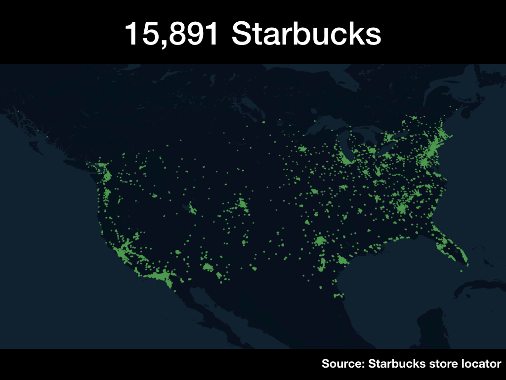
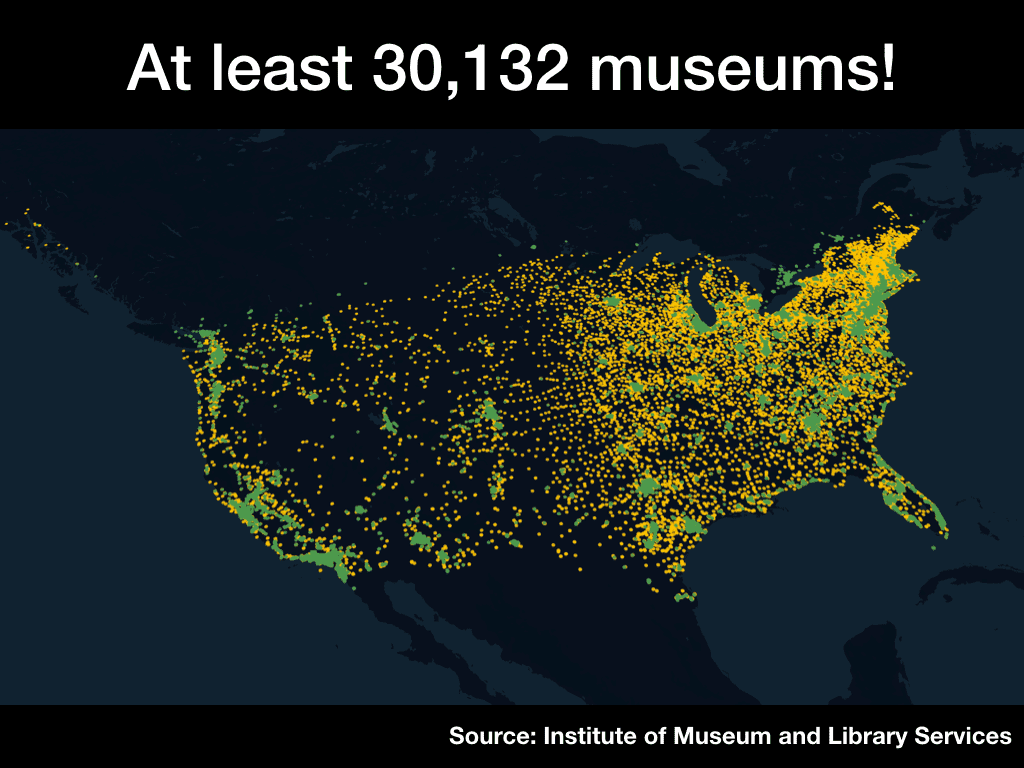
Mapping museums against Starbucks
I needed a way to emphasize quite how many tiny museums there are in the USA. I decided to do this with a visualization.
It turns out there are 15,891 branches of Starbucks in the USA… and at least 30,132 museums!
I made these maps using a couple of sources.
All The Places is a crowdsourced scraper project which aims to build scrapers for every company that has a “store locator” area of their website. Starbucks has a store locator and All The Places have a scraper for it, so you can download GeoJSON of every Starbucks. I wrote a quick script to import that GeoJSON into Datasette using sqlite-utils.
The Institute of Museum and Library Services is an independent agency of the federal government that supports museums and libraries across the country. They publish a dataset of Museums in the USA as a set of CSV files. I used csvs-to-sqlite to load those into Datasette, than ran a union query to combine the three files together.
So I have Datasette instances (with a CSV export feature) for both Starbucks and USA museums, with altitudes and longitudes for each.
Now how to turn that into a map?
I turned to my new favourite GIS tool, Kepler. Kepler is an open source GIS visualization tool released by Uber, based on WebGL. It’s astonishingly powerful and can be used directly in your browser by clicking the “Get Started” button on their website (which I assumed would take you to installation instructions, but no, it loads up the entire tool in your browser).
You can import millions of points of data into Kepler and it will visualize them for you directly. I used a Datasette query to export the CSVs, then loaded in my Starbucks CSV, exported an image, loaded in the Museums CSV as a separate colour and exported a second image. The whole project ended up taking about 15 minutes. Kepler is a great addition to the toolbelt!
Animating the PG&E outages
My PG&E outages scraper continues to record a snapshot of the PG&E outage map JSON every ten minutes. I’m posting updates to a thread on Twitter, but discovering Kepler inspired me to look at more sophisticated visualization options.
This tutorial by Giuseppe Macrì tipped me off the the fact that you can use Kepler to animate points against timestamps!
Here’s the result: a video animation showing how PG&E’s outages have evolved since the 5th of October:
Here’s a video animation of PG&E’s outages from October 5th up until just a few minutes ago pic.twitter.com/50K3BrROZR
- Simon Willison (@simonw) October 28, 2019
Hayes Valley Trees
The city announced plans to cut down 27 ficus trees in our neighborhood in San Francisco. I’ve been working with Natalie to help a small group of citizens organize an appeal, and this weekend I helped run a survey of the affected trees (recording their exact locations in a CSV file) and then built www.hayes-valley-trees.com (source on GitHub) to link to from fliers attached to each affected tree.
It started out as a Datasette (running on Glitch) but since it’s only 27 data points I ended up freezing the data in a static JSON file to avoid having to tolerate any cold start times. The site is deployed as static assets on Zeit Now using their handy GitHub continuous deployment tool.
Streaks
It turns out I’m very motivated by streaks: I’m at 342 days for Duolingo Spanish and 603 days for an Apple Watch move streak. Could I apply this to other things in my life?
I asked on Twitter and was recommended the Streaks iOS app. It’s beautiful! I’m now tracking streaks for guitar practice, Duolingo, checking email, checking Slack, reading some books and adding a new museum to www.niche-museums.com (if I add one a day I can get from 17 museums today to 382 in a year!)
It seems to be working pretty well so far. I particularly like their iPhone widget.

More recent articles
- OpenAI’s accidental cyberattack against Hugging Face is science fiction that happened - 22nd July 2026
- A Fireside Chat with Cat and Thariq from the Claude Code team - 21st July 2026
- Kimi K3, and what we can still learn from the pelican benchmark - 16th July 2026