9 posts tagged “observable-plot”
The Observable Plot JavaScript visualization library.
2024
Announcing Deno 2. The big focus of Deno 2 is compatibility with the existing Node.js and npm ecosystem:
Deno 2 takes all of the features developers love about Deno 1.x — zero-config, all-in-one toolchain for JavaScript and TypeScript development, web standard API support, secure by default — and makes it fully backwards compatible with Node and npm (in ESM).
The npm support is documented here. You can write a script like this:
import * as emoji from "npm:node-emoji";
console.log(emoji.emojify(`:sauropod: :heart:  npm`));
And when you run it Deno will automatically fetch and cache the required dependencies:
deno run main.js
Another new feature that caught my eye was this:
deno jupyternow supports outputting images, graphs, and HTML
Deno has apparently shipped with a Jupyter notebook kernel for a while, and it's had a major upgrade in this release.
Here's Ryan Dahl's demo of the new notebook support in his Deno 2 release video.
I tried this out myself, and it's really neat. First you need to install the kernel:
deno juptyer --install
I was curious to find out what this actually did, so I dug around in the code and then further in the Rust runtimed dependency. It turns out installing Jupyter kernels, at least on macOS, involves creating a directory in ~/Library/Jupyter/kernels/deno and writing a kernel.json file containing the following:
{
  "argv": [
    "/opt/homebrew/bin/deno",
    "jupyter",
    "--kernel",
    "--conn",
    "{connection_file}"
  ],
  "display_name": "Deno",
  "language": "typescript"
}
That file is picked up by any Jupyter servers running on your machine, and tells them to run deno jupyter --kernel ... to start a kernel.
I started Jupyter like this:
jupyter-notebook /tmp
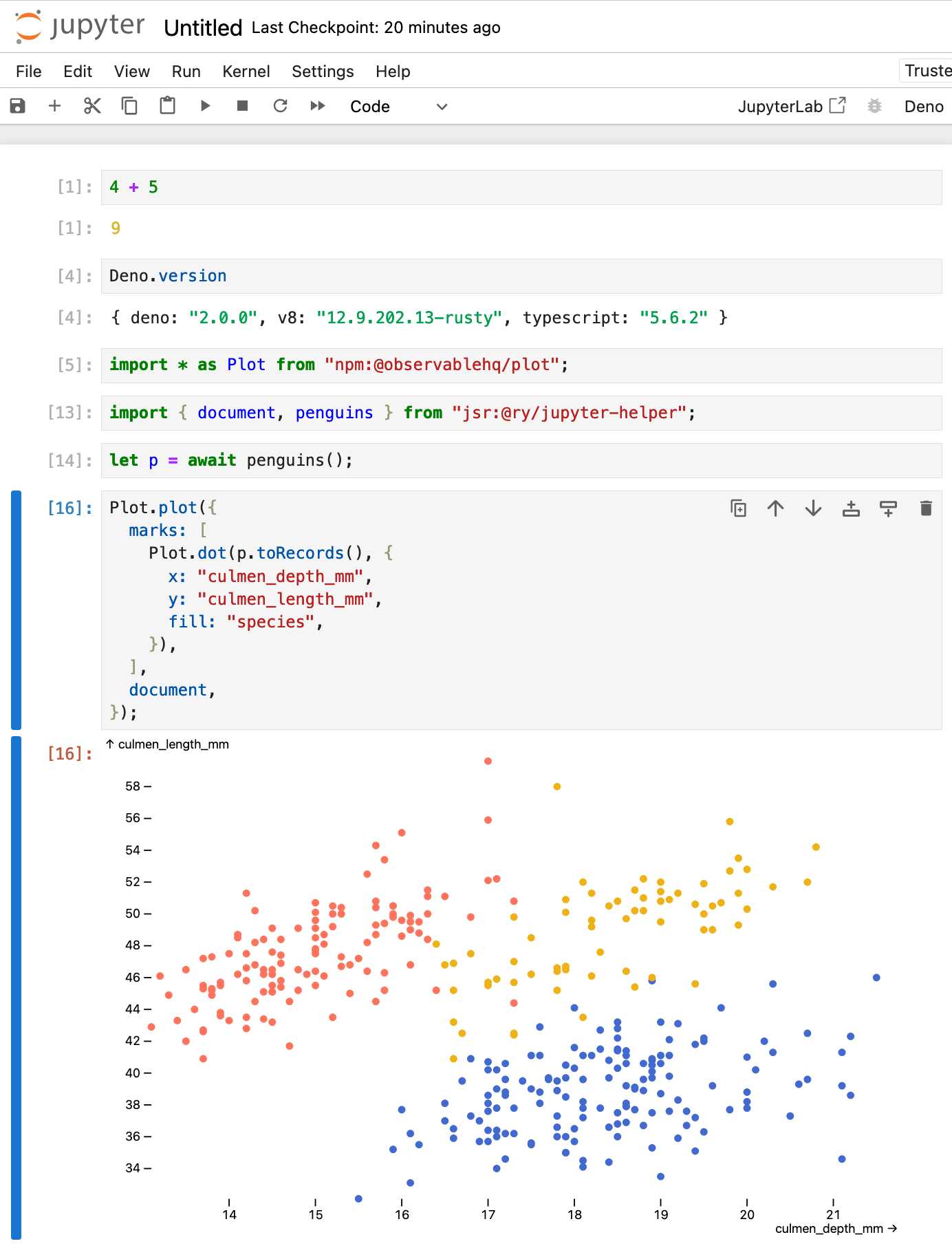
Then started a new notebook, selected the Deno kernel and it worked as advertised:

import * as Plot from "npm:@observablehq/plot";
import { document, penguins } from "jsr:@ry/jupyter-helper";
let p = await penguins();

Plot.plot({
  marks: [
    Plot.dot(p.toRecords(), {
      x: "culmen_depth_mm",
      y: "culmen_length_mm",
      fill: "species",
    }),
  ],
  document,
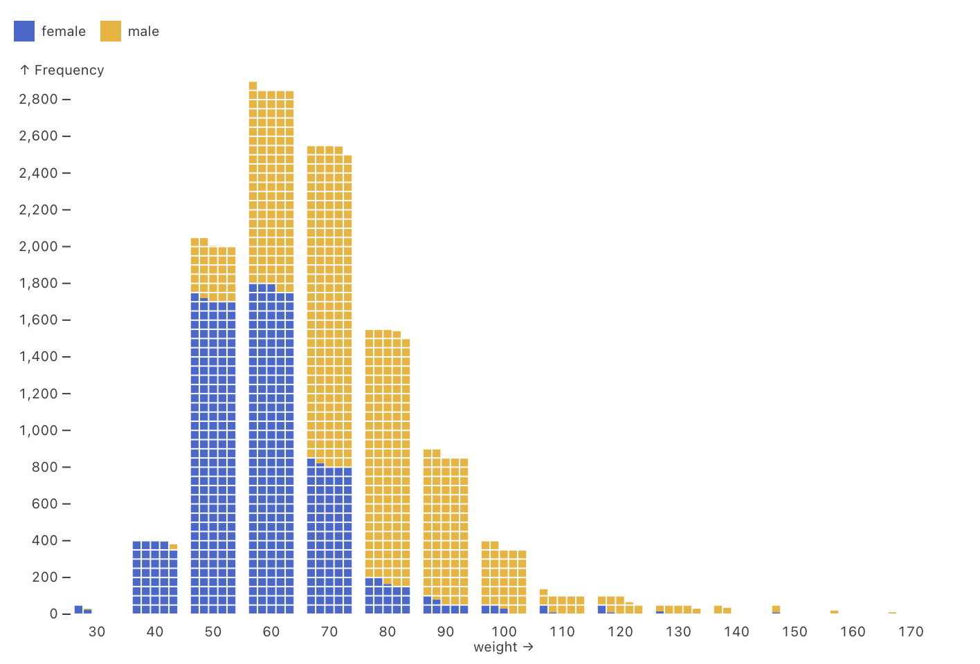
});Observable Plot: Waffle mark (via) New feature in Observable Plot 0.6.16: the waffle mark! I really like this one. Here's an example showing the gender and weight of athletes in this year's Olympics:

Interesting ideas in Observable Framework
Mike Bostock, Announcing: Observable Framework:
[... 2,123 words]2023
datasette-plot—a new Datasette Plugin for building data visualizations. I forgot to link to this here last week: Alex Garcia released the first version of datasette-plot, a brand new Datasette visualization plugin built on top of the Observable Plot charting library. We plan to use this as the new, updated alternative to my older datasette-vega plugin.
2022
GitHub Burndown (via) Neat Observable notebook by Tom MacWright—give it a GitHub access token and the name of a repo and it pulls the details of every issue and plots a burndown chart over time, showing how long issues stay open for. The code is worth spending some time with—the way it fetches data from the paginated JSON API is a really great example of using generators with Observable, and the chart itself is a lovely clear example of Observable Plot.
Observable Plot Cheatsheets (via) Beautiful new set of cheatsheets by Mike Freeman for the Observable Plot charting library. This is really top notch documentation—the cheatsheets are available as printable PDFs but the real value here is in the interactive versions of them, which include Observable-powered sliders to tweak the different examples and copy out the resulting generated code.
2021
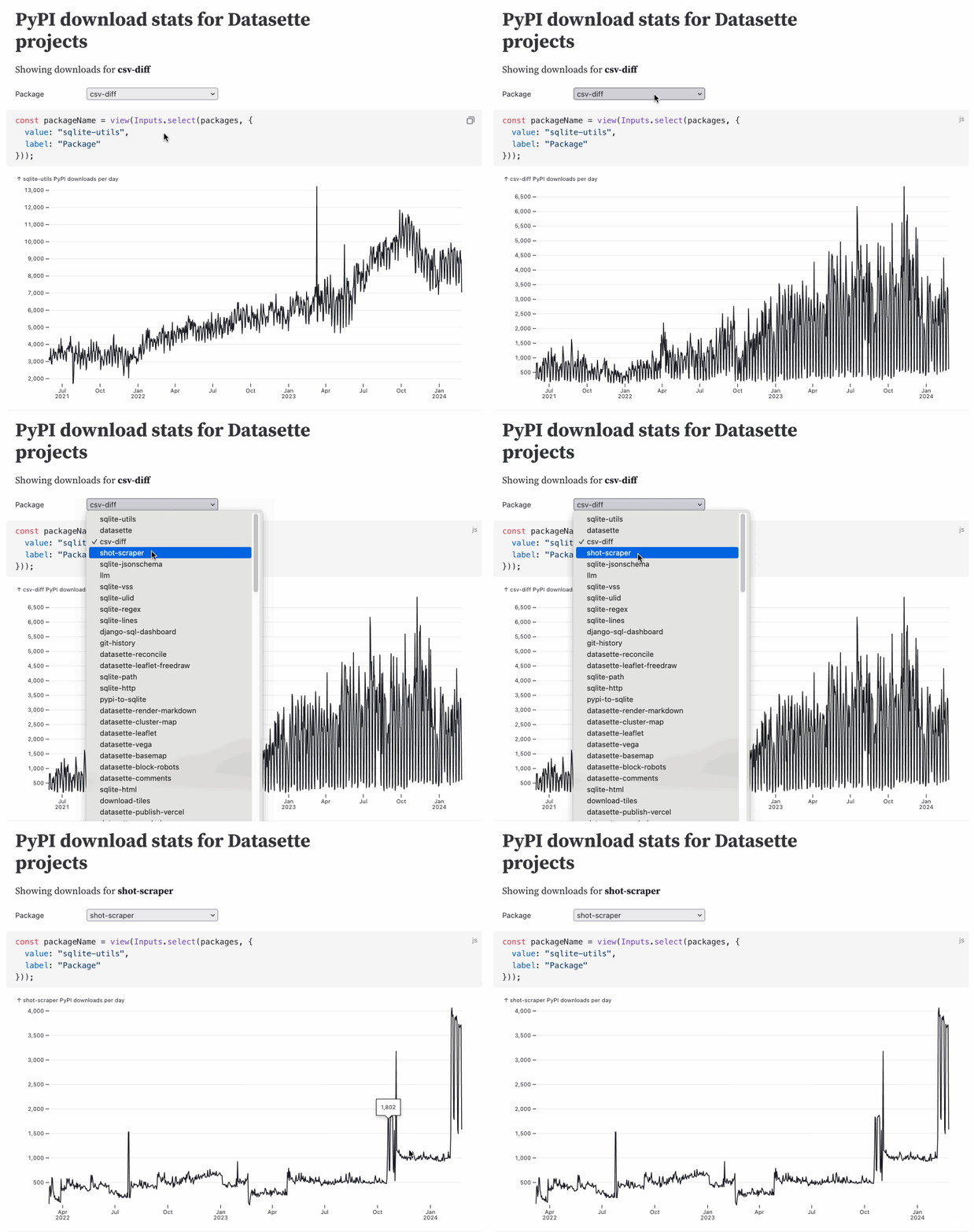
Datasette downloads per day (with Observable Plot) (via) I built an Observable notebook that imports PyPI package download data from datasette.io (itself scraped from pypistats.org using a scheduled GitHub Action) and plots it using Observable Plot. Datasette downloads from PyPI apparently jumped from ~800/day in May to ~4,000/day in July—would love to know why!
Plot & Vega-Lite. Useful documentation comparing the brand new Observable Plot to Vega-Lite, complete with examples of how to achieve the same thing in both libraries.
Observable Plot (via) This is huge: a brand new high-level JavaScript visualization library from Mike Bostock, the author of D3—partially inspired by Vega-Lite which I’ve used enthusiastically in the past. First impressions are that this is a big step forward for quickly building high-quality visualizations. It’s released under the ISC license which is “functionally equivalent to the BSD 2-Clause and MIT licenses”.
