Posts tagged usability in 2024
Filters: Year: 2024 × usability × Sorted by date
ChatGPT Canvas can make API requests now, but it’s complicated

Today’s 12 Days of OpenAI release concerned ChatGPT Canvas, a new ChatGPT feature that enables ChatGPT to pop open a side panel with a shared editor in it where you can collaborate with ChatGPT on editing a document or writing code.
[... 1,116 words]The problem with passkeys is that they're essentially a halfway house to a password manager, but tied to a specific platform in ways that aren't obvious to a user at all, and liable to easily leave them unable to access of their accounts. [...]
Chrome on Windows stores your passkeys in Windows Hello, so if you sign up for a service on Windows, and you then want to access it on iPhone, you're going to be stuck (unless you're so forward thinking as to add a second passkey, somehow, from the iPhone will on the Windows computer!). The passkey lives on the wrong device, if you're away from the computer and want to login, and it's not at all obvious to most users how they might fix that.
Consumer products have had growth hackers for many years optimizing every part of the onboarding funnel. Dev tools should do the same. Getting started shouldn't be an afterthought after you built the product. Getting started is the product!
And I mean this to the point where I think it's worth restructuring your entire product to enable fast onboarding. Get rid of mandatory config. Make it absurdly easy to set up API tokens. Remove all the friction. Make it possible for users to use your product on their laptop in a couple of minutes, tops.
ChatGPT in “4o” mode is not running the new features yet
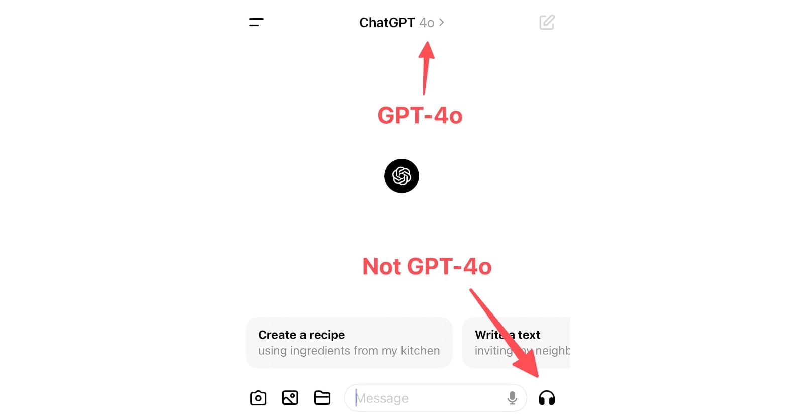
Monday’s OpenAI announcement of their new GPT-4o model included some intriguing new features:
[... 898 words]How do you accidentally run for President of Iceland? (via) Anna Andersen writes about a spectacular user interface design case-study from this year's Icelandic presidential election.
Running for President requires 1,500 endorsements. This year, those endorsements can be filed online through a government website.
The page for collecting endorsements originally had two sections - one for registering to collect endorsements, and another to submit your endorsement. The login link for the first came higher on the page, and at least 11 people ended up accidentally running for President!
A bad survey won’t tell you it’s bad. It’s actually really hard to find out that a bad survey is bad — or to tell whether you have written a good or bad set of questions. Bad code will have bugs. A bad interface design will fail a usability test. It’s possible to tell whether you are having a bad user interview right away. Feedback from a bad survey can only come in the form of a second source of information contradicting your analysis of the survey results.
Most seductively, surveys yield responses that are easy to count and counting things feels so certain and objective and truthful.
Even if you are counting lies.
The language issues are indicative of the bigger problem facing the AI Pin, ChatGPT, and frankly, every other AI product out there: you can’t see how it works, so it’s impossible to figure out how to use it. [...] our phones are constant feedback machines — colored buttons telling us what to tap, instant activity every time we touch or pinch or scroll. You can see your options and what happens when you pick one. With AI, you don’t get any of that. Using the AI Pin feels like wishing on a star: you just close your eyes and hope for the best. Most of the time, nothing happens.
The Articulation Barrier: Prompt-Driven AI UX Hurts Usability. Jakob Nielsen: “Generative AI systems like ChatGPT use prose prompts for intent-based outcomes, requiring users to be articulate in writing prose, which is a challenge for half of the population in rich countries.”
If you have had any prior experience with personal computers, what you might expect to see is some sort of opaque code, called a “prompt,” consisting of phosphorescent green or white letters on a murky background. What you see with Macintosh is the Finder. On a pleasant, light background (you can later change the background to any of a number of patterns, if you like), little pictures called “icons” appear, representing choices available to you.
— Steven Levy, in 1984
The Eight Golden Rules of Interface Design (via) By HCI researcher Ben Shneiderman. I particularly like number 4, “Design dialogs to yield closure”, which encourages feedback at the completion of a group of actions that “gives users the satisfaction of accomplishment, a sense of relief.”