Blogmarks tagged css, html
Filters: Type: blogmark × css × html × Sorted by date
CSS Minecraft (via) Incredible project by Benjamin Aster:
There is no JavaScript on this page. All the logic is made 100% with pure HTML & CSS. For the best performance, please close other tabs and running programs.
The page implements a full Minecraft-style world editor: you can place and remove blocks of 7 different types in a 9x9x9 world, and rotate that world in 3D to view it from different angles.
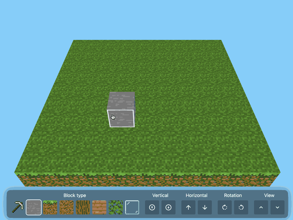
It's implemented in just 480 lines of CSS... and 46,022 lines (3.07MB) of HTML!
The key trick that gets this to work is labels combined with the has() selector. The page has 35,001 <label> elements and 5,840 <input type="radio"> elements - those radio elements are the state storage engine. Clicking on any of the six visible faces of a cube is clicking on a label, and the for="" of that label is the radio box for the neighboring cube in that dimension.
When you switch materials you're actually switching the available visible labels:
.controls:has(
  > .block-chooser > .stone > input[type=radio]:checked
) ~ main .cubes-container > .cube:not(.stone) {
  display: none;
}
Claude Opus 4 explanation: "When the "stone" radio button is checked, all cube elements except those with the .stone class are hidden (display: none)".
Here's a shortened version of the Pug template (full code here) which illustrates how the HTML structure works:
//- pug index.pug -w
- const blocks = ["air", "stone", "grass", "dirt", "log", "wood", "leaves", "glass"];
- const layers = 9;
- const rows = 9;
- const columns = 9;
<html lang="en" style="--layers: #{layers}; --rows: #{rows}; --columns: #{columns}">
<!-- ... -->
<div class="blocks">
  for _, layer in Array(layers)
    for _, row in Array(rows)
      for _, column in Array(columns)
        <div class="cubes-container" style="--layer: #{layer}; --row: #{row}; --column: #{column}">
          - const selectedBlock = layer === layers - 1 ? "grass" : "air";
          - const name = `cube-layer-${layer}-row-${row}-column-${column}`;
          <div class="cube #{blocks[0]}">
            - const id = `${name}-${blocks[0]}`;
            <input type="radio" name="#{name}" id="#{id}" !{selectedBlock === blocks[0] ? "checked" : ""} />
            <label for="#{id}" class="front"></label>
            <label for="#{id}" class="back"></label>
            <label for="#{id}" class="left"></label>
            <label for="#{id}" class="right"></label>
            <label for="#{id}" class="top"></label>
            <label for="#{id}" class="bottom"></label>
          </div>
          each block, index in blocks.slice(1)
            - const id = `${name}-${block}`;
            - const checked = index === 0;
            <div class="cube #{block}">
              <input type="radio" name="#{name}" id="#{id}" !{selectedBlock === block ? "checked" : ""} />
              <label for="cube-layer-#{layer}-row-#{row + 1}-column-#{column}-#{block}" class="front"></label>
              <label for="cube-layer-#{layer}-row-#{row - 1}-column-#{column}-#{block}" class="back"></label>
              <label for="cube-layer-#{layer}-row-#{row}-column-#{column + 1}-#{block}" class="left"></label>
              <label for="cube-layer-#{layer}-row-#{row}-column-#{column - 1}-#{block}" class="right"></label>
              <label for="cube-layer-#{layer - 1}-row-#{row}-column-#{column}-#{block}" class="top"></label>
              <label for="cube-layer-#{layer + 1}-row-#{row}-column-#{column}-#{block}" class="bottom"></label>
            </div>
          //- /each
        </div>
      //- /for
    //- /for
  //- /for
</div>
<!-- ... -->
So for every one of the 9x9x9 = 729 cubes there is a set of eight radio boxes sharing the same name such as cube-layer-0-row-0-column-3 - which means it can have one of eight values ("air" is clear space, the others are material types). There are six labels, one for each side of the cube - and those label for="" attributes target the next block over of the current selected, visible material type.
The other brilliant technique is the way it implements 3D viewing with controls for rotation and moving the viewport. The trick here relies on CSS animation:
.controls:has(.up:active) ~ main .down {
  animation-play-state: running;
}
.controls:has(.down:active) ~ main .up {
  animation-play-state: running;
}
.controls:has(.clockwise:active) ~ main .clockwise {
  animation-play-state: running;
}
.controls:has(.counterclockwise:active) ~ main .counterclockwise {
  animation-play-state: running;
}
Then later on there are animations defined for each of those different controls:
.content .clockwise {
  animation: var(--animation-duration) linear 1ms paused rotate-clockwise;
}
@keyframes rotate-clockwise {
  from {
    rotate: y 0turn;
  }
  to {
    rotate: y calc(-1 * var(--max-rotation));
  }
}
.content .counterclockwise {
  animation: var(--animation-duration) linear 1ms paused rotate-counterclockwise;
}
@keyframes rotate-counterclockwise {
  from {
    rotate: y 0turn;
  }
  to {
    rotate: y calc(var(--max-rotation));
  }
}
Any time you hold the mouse down on one of the controls you switch the animation state out of paused to running, until you release that button again. As the animation runs it changes the various 3D transform properties applied to the selected element.
It's fiendishly clever, and actually quite elegant and readable once you figure out the core tricks it's using.
Default styles for h1 elements are changing
(via)
Wow, this is a rare occurrence! Firefox are rolling out a change to the default user-agent stylesheet for nested <h1> elements, currently ramping from 5% to 50% of users and with full roll-out planned for Firefox 140 in June 2025. Chrome is showing deprecation warnings and Safari are expected to follow suit in the future.
What's changing? The default sizes of <h1> elements that are nested inside <article>, <aside>, <nav> and <section>.
These are the default styles being removed:
/* where x is :is(article, aside, nav, section) */
x h1 { margin-block: 0.83em; font-size: 1.50em; }
x x h1 { margin-block: 1.00em; font-size: 1.17em; }
x x x h1 { margin-block: 1.33em; font-size: 1.00em; }
x x x x h1 { margin-block: 1.67em; font-size: 0.83em; }
x x x x x h1 { margin-block: 2.33em; font-size: 0.67em; }
The short version is that, many years ago, the HTML spec introduced the idea that an <h1> within a nested section should have the same meaning (and hence visual styling) as an <h2>. This never really took off and wasn't reflected by the accessibility tree, and was removed from the HTML spec in 2022. The browsers are now trying to cleanup the legacy default styles.
This advice from that post sounds sensible to me:
- Do not rely on default browser styles for conveying a heading hierarchy. Explicitly define your document hierarchy using
<h2>for second-level headings,<h3>for third-level, etc.- Always define your own
font-sizeandmarginfor<h1>elements.
Backstory on the default styles for the HTML dialog modal. My TIL about Styling an HTML dialog modal to take the full height of the viewport (here's the interactive demo) showed up on Hacker News this morning, and attracted this fascinating comment from Chromium engineer Ian Kilpatrick.
There's quite a bit of history here, but the abbreviated version is that the dialog element was originally added as a replacement for window.alert(), and there were a libraries polyfilling dialog and being surprisingly widely used.
The mechanism which dialog was originally positioned was relatively complex, and slightly hacky (magic values for the insets).
Changing the behaviour basically meant that we had to add "overflow:auto", and some form of "max-height"/"max-width" to ensure that the content within the dialog was actually reachable.
The better solution to this was to add "max-height:stretch", "max-width:stretch". You can see the discussion for this here.
The problem is that no browser had (and still has) shipped the "stretch" keyword. (Blink likely will "soon")
However this was pushed back against as this had to go in a specification - and nobody implemented it ("-webit-fill-available" would have been an acceptable substitute in Blink but other browsers didn't have this working the same yet).
Hence the calc() variant. (Primarily because of "box-sizing:content-box" being the default, and pre-existing border/padding styles on dialog that we didn't want to touch). [...]
I particularly enjoyed this insight into the challenges of evolving the standards that underlie the web, even for something this small:
One thing to keep in mind is that any changes that changes web behaviour is under some time pressure. If you leave something too long, sites will start relying on the previous behaviour - so it would have been arguably worse not to have done anything.
Also from the comments I learned that Firefox DevTools can show you user-agent styles, but that option is turned off by default - notes on that here. Once I turned this option on I saw references to an html.css stylesheet, so I dug around and found that in the Firefox source code. Here's the commit history for that file on the official GitHub mirror, which provides a detailed history of how Firefox default HTML styles have evolved with the standards over time.
And via uallo here are the same default HTML styles for other browsers:
TIL: Styling an HTML dialog modal to take the full height of the viewport.
I spent some time today trying to figure out how to have a modal <dialog> element present as a full height side panel that animates in from the side. The full height bit was hard, until Natalie helped me figure out that browsers apply a default max-height: calc(100% - 6px - 2em); rule which needs to be over-ridden.
Also included: some spelunking through the HTML spec to figure out where that calc() expression was first introduced. The answer was November 2020.
Clay UI library (via) Fascinating project by Nic Barker, who describes Clay like this:
Clay is a flex-box style UI auto layout library in C, with declarative syntax and microsecond performance.
His intro video to the library is outstanding: I learned a ton about how UI layout works from this, and the animated visual explanations are clear, tasteful and really helped land the different concepts:
Clay is a C library delivered in a single ~2000 line clay.h dependency-free header file. It only handles layout calculations: if you want to render the result you need to add an additional rendering layer.
In a fascinating demo of the library, the Clay site itself is rendered using Clay C compiled to WebAssembly! You can even switch between the default HTML renderer and an alternative based on Canvas.
This isn't necessarily a great idea: because the layout is entirely handled using <div> elements positioned using transform: translate(0px, 70px) style CSS attempting to select text across multiple boxes behaves strangely, and it's not clear to me what the accessibility implications are.
Update: Matt Campbell:
The accessibility implications are as serious as you might guess. The links aren't properly labeled, there's no semantic markup such as headings, and since there's a div for every line, continuous reading with a screen reader is choppy, that is, it pauses at the end of every physical line.
It does make for a very compelling demo of what Clay is capable of though, especially when you resize your browser window and the page layout is recalculated in real-time via the Clay WebAssembly bridge.
You can hit "D" on the website and open up a custom Clay debugger showing the hierarchy of layout elements on the page:
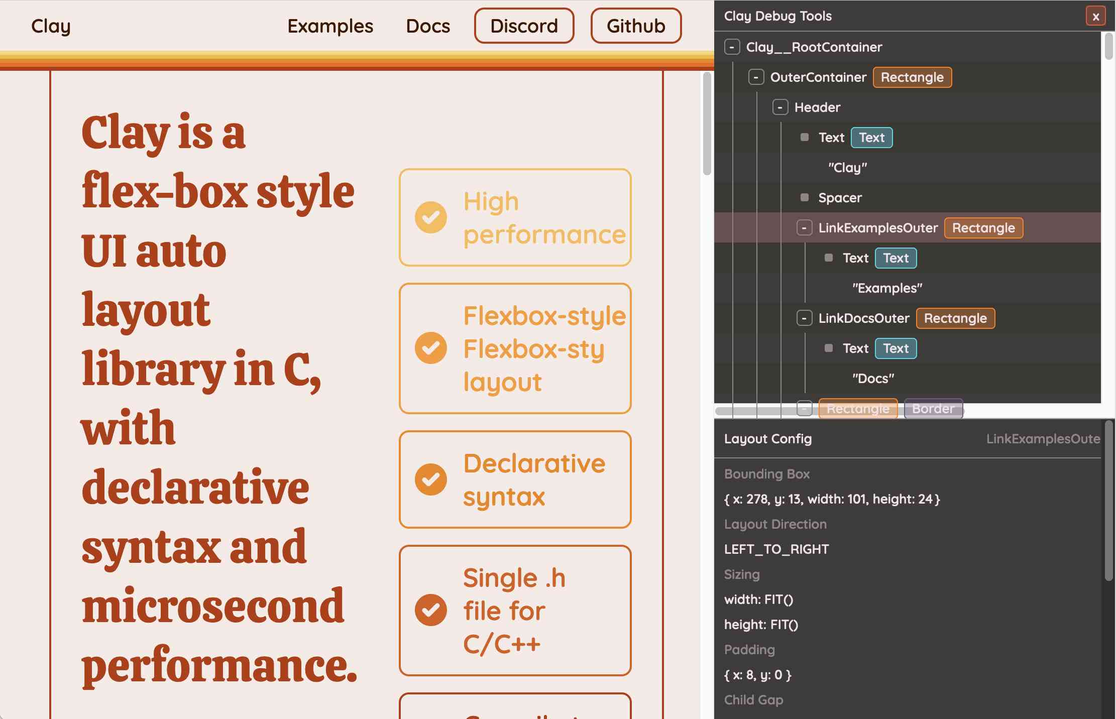
This also means that the entire page is defined using C code! Given that, I find the code itself surprisingly readable
void DeclarativeSyntaxPageDesktop() {
  CLAY(CLAY_ID("SyntaxPageDesktop"), CLAY_LAYOUT({ .sizing = { CLAY_SIZING_GROW(), CLAY_SIZING_FIT({ .min = windowHeight - 50 }) }, .childAlignment = {0, CLAY_ALIGN_Y_CENTER}, .padding = {.x = 50} })) {
    CLAY(CLAY_ID("SyntaxPage"), CLAY_LAYOUT({ .sizing = { CLAY_SIZING_GROW(), CLAY_SIZING_GROW() }, .childAlignment = { 0, CLAY_ALIGN_Y_CENTER }, .padding = { 32, 32 }, .childGap = 32 }), CLAY_BORDER({ .left = { 2, COLOR_RED }, .right = { 2, COLOR_RED } })) {
      CLAY(CLAY_ID("SyntaxPageLeftText"), CLAY_LAYOUT({ .sizing = { CLAY_SIZING_PERCENT(0.5) }, .layoutDirection = CLAY_TOP_TO_BOTTOM, .childGap = 8 })) {
        CLAY_TEXT(CLAY_STRING("Declarative Syntax"), CLAY_TEXT_CONFIG({ .fontSize = 52, .fontId = FONT_ID_TITLE_56, .textColor = COLOR_RED }));
        CLAY(CLAY_ID("SyntaxSpacer"), CLAY_LAYOUT({ .sizing = { CLAY_SIZING_GROW({ .max = 16 }) } })) {}
        CLAY_TEXT(CLAY_STRING("Flexible and readable declarative syntax with nested UI element hierarchies."), CLAY_TEXT_CONFIG({ .fontSize = 28, .fontId = FONT_ID_BODY_36, .textColor = COLOR_RED }));
        CLAY_TEXT(CLAY_STRING("Mix elements with standard C code like loops, conditionals and functions."), CLAY_TEXT_CONFIG({ .fontSize = 28, .fontId = FONT_ID_BODY_36, .textColor = COLOR_RED }));
        CLAY_TEXT(CLAY_STRING("Create your own library of re-usable components from UI primitives like text, images and rectangles."), CLAY_TEXT_CONFIG({ .fontSize = 28, .fontId = FONT_ID_BODY_36, .textColor = COLOR_RED }));
      }
      CLAY(CLAY_ID("SyntaxPageRightImage"), CLAY_LAYOUT({ .sizing = { CLAY_SIZING_PERCENT(0.50) }, .childAlignment = {.x = CLAY_ALIGN_X_CENTER} })) {
        CLAY(CLAY_ID("SyntaxPageRightImageInner"), CLAY_LAYOUT({ .sizing = { CLAY_SIZING_GROW({ .max = 568 }) } }), CLAY_IMAGE({ .sourceDimensions = {1136, 1194}, .sourceURL = CLAY_STRING("/clay/images/declarative.png") })) {}
      }
    }
  }
}
I'm not ready to ditch HTML and CSS for writing my web pages in C compiled to WebAssembly just yet, but as an exercise in understanding layout engines (and a potential tool for building non-web interfaces in the future) this is a really interesting project to dig into.
To clarify here: I don't think the web layout / WebAssembly thing is the key idea behind Clay at all - I think it's a neat demo of the library, but it's not what Clay is for. It's certainly an interesting way to provide a demo of a layout library!
Nic confirms:
You totally nailed it, the fact that you can compile to wasm and run in HTML stemmed entirely from a “wouldn’t it be cool if…” It was designed for my C projects first and foremost!
HTML for People (via) Blake Watson's brand new HTML tutorial, presented as a free online book (CC BY-NC-SA 4.0, on GitHub). This seems very modern and well thought-out to me. It focuses exclusively on HTML, skipping JavaScript entirely and teaching with Simple.css to avoid needing to dig into CSS while still producing sites that are pleasing to look at. It even touches on Web Components (described as Custom HTML tags) towards the end.
The Page With No Code
(via)
A fun demo by Dan Q, who created a web page with no HTML at all - but in Firefox it still renders content, thanks to a data URI base64 encoded stylesheet served in a link: header that uses html::before, html::after, body::before and body::after with content: properties to serve the content. It even has a background image, encoded as a base64 SVG nested inside another data URI.
Paper 5 | Scribd (via) A more impressive example of Scribd’s new HTML/CSS document viewer: a mathematics-heavy LaTeX paper by one of Scribd’s engineers.
Scribd in HTML5. Outstanding piece of engineering work from Scribd—they can now render documents using HTML, webfonts and a ton of CSS absolute positioning (using ems rather than pixels) instead of Flash. Nothing to do with HTML5 of course, which is rapidly replacing Ajax as the most mis-applied terminology on the Web. That nit-pick feels pretty insignificant compared to their overall achievement though—being able to convert any formatted document (.doc, pdf etc) in to HTML and CSS that displays correctly is a real leap forward.
FireScope. Neat little Firefox / Firebug extension which adds a “Reference” tab showing documentation for the selected element from the comprehensive SitePoint Reference site.
Conditional classnames. Yahoo!’s internal coding standards still recommend CSS hacks over conditional comments because a separate stylesheet for IE imposes an additional HTTP request. Paul Hammond points out that you can use conditional comments to write out an extra class=“ie” attribute on the body element and use that to target the IE specific fixes in your stylesheets.
jQuery 1.2. Lots of neat new stuff; my favourite new feature is “Partial .load()” which lets you pull in HTML with Ajax and then use a CSS selector to grab a subset of that page and inject it in to the DOM.
WebCore Rendering I—The Basics. Dave Hyatt has started a series of posts explaining the internals of WebCore’s rendering system.
The CSS Redundancy Checker. A tool for checking your markup for outdated CSS rules that don’t match any of your HTML. We were discussing the need for something similar to this at Torchbox a few weeks ago.
start.gotapi.com. Lightning fast lookups of API documentation; includes Python docs, YUI, HTML, CSS and lots more.