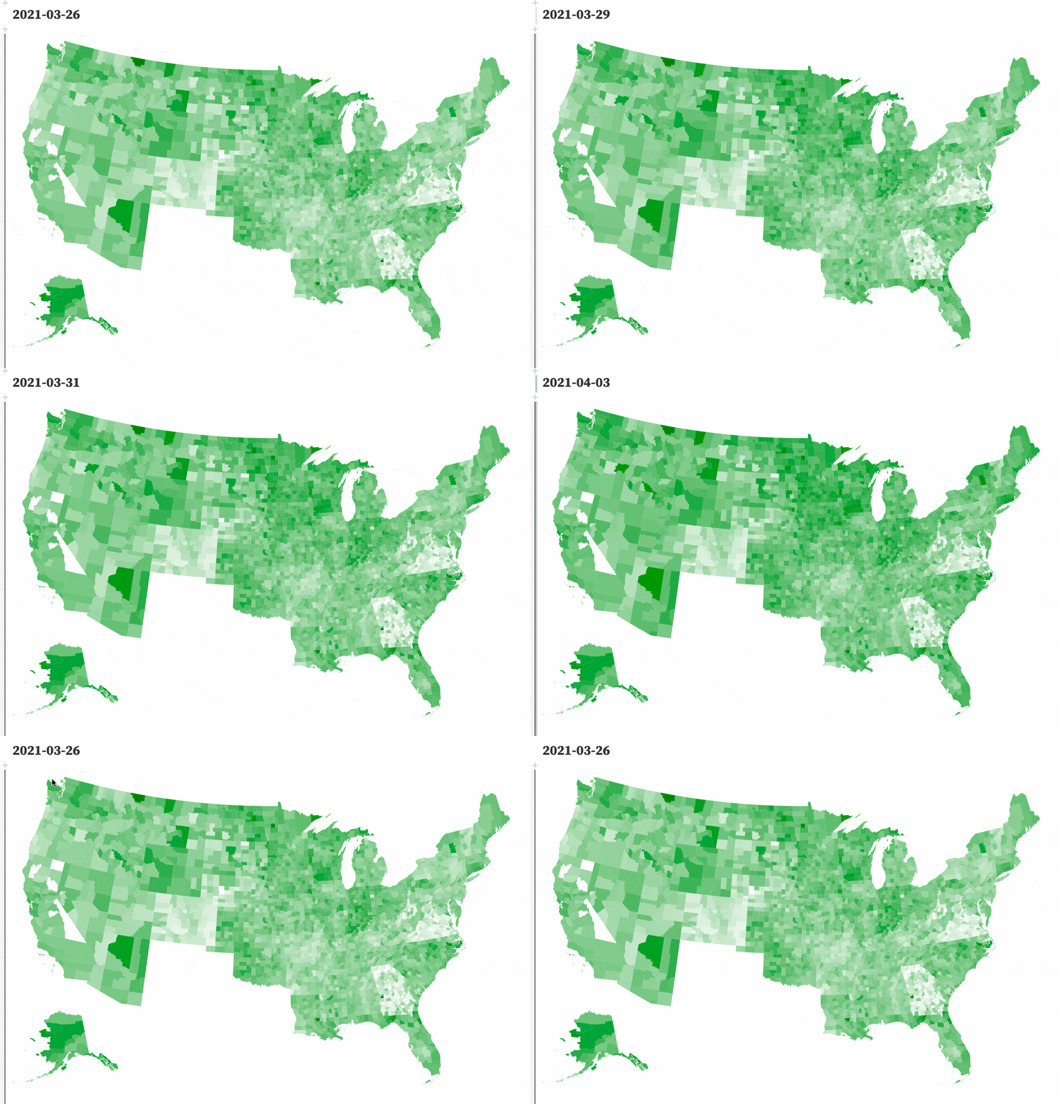
Animated choropleth of vaccinations by US county
4th April 2021
Last week I mentioned that I’ve recently started scraping and storing the CDC’s per-county vaccination numbers in my cdc-vaccination-history GitHub repository. This week I used an Observable notebook and d3’s TopoJSON support to render those numbers on an animated choropleth map.

The full code is available at https://observablehq.com/@simonw/us-county-vaccinations-choropleth-map
From scraper to Datasette
My scraper for this data is a single line in a GitHub Actions workflow:
curl https://covid.cdc.gov/covid-data-tracker/COVIDData/getAjaxData?id=vaccination_county_condensed_data \
  | jq . > counties.json
I pipe the data through jq to pretty-print it, just to get nicer diffs.
My build_database.py script then iterates over the accumulated git history of that counties.json file and uses sqlite-utils to build a SQLite table:
for i, (when, hash, content) in enumerate(
    iterate_file_versions(".", ("counties.json",))
):
    try:
        counties = json.loads(
            content
        )["vaccination_county_condensed_data"]
    except ValueError:
        # Bad JSON
        continue
    for county in counties:
        id = county["FIPS"] + "-" + county["Date"]
        db[
            "daily_reports_counties"
        ].insert(
            dict(county, id=id), pk="id",
            alter=True, replace=True
        )
The resulting table can be seen at cdc/daily_reports_counties.
From Datasette to Observable
Observable notebooks are my absolute favourite tool for prototyping new visualizations. There are examples of pretty much anything you could possibly want to create, and the Observable ecosystem actively encourages forking and sharing new patterns.
Loading data from Datasette into Observable is easy, using Datasette’s various HTTP APIs. For this visualization I needed to pull two separate things from Datasette.
Firstly, for any given date I need the full per-county vaccination data. Here’s the full table filtered for April 2nd for example.
Since that’s 3,221 rows Datasette’s JSON export would need to be paginated... but Datasette’s CSV export can stream all 3,000+ rows in a single request. So I’m using that, fetched using the d3.csv() function:
county_data = await d3.csv(
    `https://cdc-vaccination-history.datasette.io/cdc/daily_reports_counties.csv?_stream=on&Date=${county_date}&_size=max`
);
In order to animate the different dates, I need a list of available dates. I can get those with a SQL query:
select distinct Date
from daily_reports_counties
order by Date
Datasette’s JSON API has a ?_shape=arrayfirst option which will return a single JSON array of the first values in each row, which means I can do this:
And get back just the dates as an array:
[
  "2021-03-26",
  "2021-03-27",
  "2021-03-28",
  "2021-03-29",
  "2021-03-30",
  "2021-03-31",
  "2021-04-01",
  "2021-04-02",
  "2021-04-03"
]
Mike Bostock has a handy Scrubber implementation which can provide a slider with the ability to play and stop iterating through values. In the notebook that can be used like so:
viewof county_date = Scrubber(county_dates, {
  delay: 500,
  autoplay: false
})

county_dates = (await fetch(
  "https://cdc-vaccination-history.datasette.io/cdc.json?sql=select%20distinct%20Date%20from%20daily_reports_counties%20order%20by%20Date&_shape=arrayfirst"
)).json()

import { Scrubber } from "@mbostock/scrubber"
Drawing the map
The map itself is rendered using TopoJSON, an extension to GeoJSON that efficiently encodes topology.
Consider the map of 3,200 counties in the USA: since counties border each other, most of those border polygons end up duplicating each other to a certain extent.
TopoJSON only stores each shared boundary once, but still knows how they relate to each other which means the data can be used to draw shapes filled with colours.
I’m using the https://d3js.org/us-10m.v1.json TopoJSON file built and published with d3. Here’s my JavaScript for rendering that into an SVG map:
{
  const svg = d3
    .create("svg")
    .attr("viewBox", [0, 0, width, 700])
    .style("width", "100%")
    .style("height", "auto");

  svg
    .append("g")
    .selectAll("path")
    .data(
      topojson.feature(topojson_data, topojson_data.objects.counties).features
    )
    .enter()
    .append("path")
    .attr("fill", function(d) {
      if (!county_data[d.id]) {
        return 'white';
      }
      let v = county_data[d.id].Series_Complete_65PlusPop_Pct;
      return d3.interpolate("white", "green")(v / 100);
    })
    .attr("d", path)
    .append("title") // Tooltip
    .text(function(d) {
      if (!county_data[d.id]) {
        return '';
      }
      return `${
        county_data[d.id].Series_Complete_65PlusPop_Pct
      }% of the 65+ population in ${county_data[d.id].County}, ${county_data[d.id].StateAbbr.trim()} have had the complete vaccination`;
    });
  return svg.node();
}
Next step: a plugin
Now that I have a working map, my next goal is to package this up as a Datasette plugin. I’m hoping to create a generic choropleth plugin which bundles TopoJSON for some common maps—probably world countries, US states and US counties to start off with—but also allows custom maps to be supported as easily as possible.
Datasette 0.56
Also this week, I shipped Datasette 0.56. It’s a relatively small release—mostly documentation improvements and bug fixes, but I’ve alse bundled SpatiaLite 5 with the official Datasette Docker image.
TIL this week
Releases this week
-
airtable-export: 0.6—(8 total releases)—2021-04-02
Export Airtable data to YAML, JSON or SQLite files on disk -
datasette: 0.56—(85 total releases)—2021-03-29
An open source multi-tool for exploring and publishing data
More recent articles
- DeepSeek V4 - almost on the frontier, a fraction of the price - 24th April 2026
- Extract PDF text in your browser with LiteParse for the web - 23rd April 2026
- A pelican for GPT-5.5 via the semi-official Codex backdoor API - 23rd April 2026