26th May 2025 - Link Blog
CSS Minecraft (via) Incredible project by Benjamin Aster:
There is no JavaScript on this page. All the logic is made 100% with pure HTML & CSS. For the best performance, please close other tabs and running programs.
The page implements a full Minecraft-style world editor: you can place and remove blocks of 7 different types in a 9x9x9 world, and rotate that world in 3D to view it from different angles.
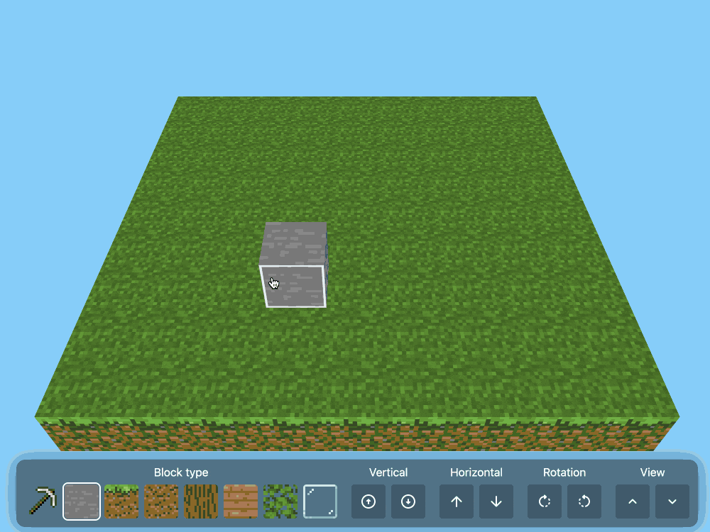
It's implemented in just 480 lines of CSS... and 46,022 lines (3.07MB) of HTML!
The key trick that gets this to work is labels combined with the has() selector. The page has 35,001 <label> elements and 5,840 <input type="radio"> elements - those radio elements are the state storage engine. Clicking on any of the six visible faces of a cube is clicking on a label, and the for="" of that label is the radio box for the neighboring cube in that dimension.
When you switch materials you're actually switching the available visible labels:
.controls:has(
  > .block-chooser > .stone > input[type=radio]:checked
) ~ main .cubes-container > .cube:not(.stone) {
  display: none;
}
Claude Opus 4 explanation: "When the "stone" radio button is checked, all cube elements except those with the .stone class are hidden (display: none)".
Here's a shortened version of the Pug template (full code here) which illustrates how the HTML structure works:
//- pug index.pug -w
- const blocks = ["air", "stone", "grass", "dirt", "log", "wood", "leaves", "glass"];
- const layers = 9;
- const rows = 9;
- const columns = 9;
<html lang="en" style="--layers: #{layers}; --rows: #{rows}; --columns: #{columns}">
<!-- ... -->
<div class="blocks">
  for _, layer in Array(layers)
    for _, row in Array(rows)
      for _, column in Array(columns)
        <div class="cubes-container" style="--layer: #{layer}; --row: #{row}; --column: #{column}">
          - const selectedBlock = layer === layers - 1 ? "grass" : "air";
          - const name = `cube-layer-${layer}-row-${row}-column-${column}`;
          <div class="cube #{blocks[0]}">
            - const id = `${name}-${blocks[0]}`;
            <input type="radio" name="#{name}" id="#{id}" !{selectedBlock === blocks[0] ? "checked" : ""} />
            <label for="#{id}" class="front"></label>
            <label for="#{id}" class="back"></label>
            <label for="#{id}" class="left"></label>
            <label for="#{id}" class="right"></label>
            <label for="#{id}" class="top"></label>
            <label for="#{id}" class="bottom"></label>
          </div>
          each block, index in blocks.slice(1)
            - const id = `${name}-${block}`;
            - const checked = index === 0;
            <div class="cube #{block}">
              <input type="radio" name="#{name}" id="#{id}" !{selectedBlock === block ? "checked" : ""} />
              <label for="cube-layer-#{layer}-row-#{row + 1}-column-#{column}-#{block}" class="front"></label>
              <label for="cube-layer-#{layer}-row-#{row - 1}-column-#{column}-#{block}" class="back"></label>
              <label for="cube-layer-#{layer}-row-#{row}-column-#{column + 1}-#{block}" class="left"></label>
              <label for="cube-layer-#{layer}-row-#{row}-column-#{column - 1}-#{block}" class="right"></label>
              <label for="cube-layer-#{layer - 1}-row-#{row}-column-#{column}-#{block}" class="top"></label>
              <label for="cube-layer-#{layer + 1}-row-#{row}-column-#{column}-#{block}" class="bottom"></label>
            </div>
          //- /each
        </div>
      //- /for
    //- /for
  //- /for
</div>
<!-- ... -->
So for every one of the 9x9x9 = 729 cubes there is a set of eight radio boxes sharing the same name such as cube-layer-0-row-0-column-3 - which means it can have one of eight values ("air" is clear space, the others are material types). There are six labels, one for each side of the cube - and those label for="" attributes target the next block over of the current selected, visible material type.
The other brilliant technique is the way it implements 3D viewing with controls for rotation and moving the viewport. The trick here relies on CSS animation:
.controls:has(.up:active) ~ main .down {
  animation-play-state: running;
}
.controls:has(.down:active) ~ main .up {
  animation-play-state: running;
}
.controls:has(.clockwise:active) ~ main .clockwise {
  animation-play-state: running;
}
.controls:has(.counterclockwise:active) ~ main .counterclockwise {
  animation-play-state: running;
}
Then later on there are animations defined for each of those different controls:
.content .clockwise {
  animation: var(--animation-duration) linear 1ms paused rotate-clockwise;
}
@keyframes rotate-clockwise {
  from {
    rotate: y 0turn;
  }
  to {
    rotate: y calc(-1 * var(--max-rotation));
  }
}
.content .counterclockwise {
  animation: var(--animation-duration) linear 1ms paused rotate-counterclockwise;
}
@keyframes rotate-counterclockwise {
  from {
    rotate: y 0turn;
  }
  to {
    rotate: y calc(var(--max-rotation));
  }
}
Any time you hold the mouse down on one of the controls you switch the animation state out of paused to running, until you release that button again. As the animation runs it changes the various 3D transform properties applied to the selected element.
It's fiendishly clever, and actually quite elegant and readable once you figure out the core tricks it's using.
Recent articles
- Highlights from my conversation about agentic engineering on Lenny's Podcast - 2nd April 2026
- Mr. Chatterbox is a (weak) Victorian-era ethically trained model you can run on your own computer - 30th March 2026
- Vibe coding SwiftUI apps is a lot of fun - 27th March 2026