6th August 2024 - Link Blog
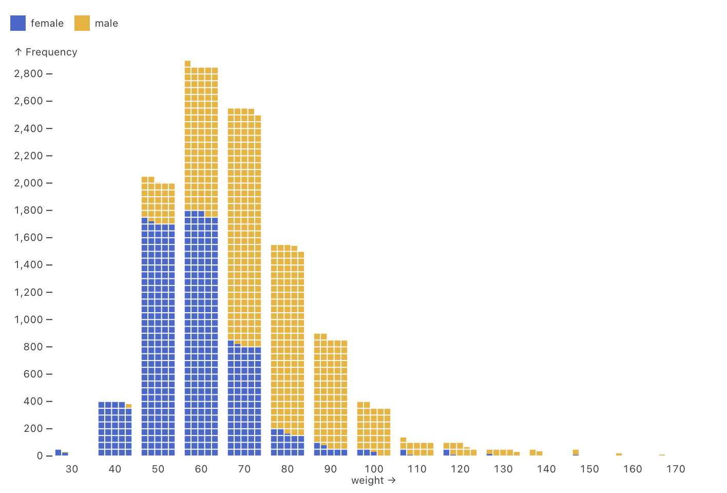
Observable Plot: Waffle mark (via) New feature in Observable Plot 0.6.16: the waffle mark! I really like this one. Here's an example showing the gender and weight of athletes in this year's Olympics:
Recent articles
- Vibe coding SwiftUI apps is a lot of fun - 27th March 2026
- Experimenting with Starlette 1.0 with Claude skills - 22nd March 2026
- Profiling Hacker News users based on their comments - 21st March 2026