Understanding the Box Model
26th May 2003
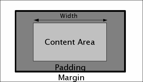
Today’s tutorial is going to be all theory. The box model is an inevitable part of CSS, and understanding it is critical if you want to do anything remotely interesting. Like most of CSS, it’s a lot simpler than it sounds. Here it is:

Before discussing the box model, it is important to understand the difference between inline and block level elements. Inline elements are things like links, <em>s and <span>s—any element that appears “inline” in a piece of text without inserting any newlines. Block level elements on the other hand always start on a new line and cause any content following them to start on a new line as well. They include things like <p>, <div> and the various header tags. Block level elements can contain both block level and inline elements, but inline elements can only contain other inline elements. An inline element can be “promoted” to behave like a block level element using the display: block; property, and the reverse can be achieved using display: inline;—note however that doing this does not change the rules about what kind of elements something can contain. The box model principally applies to block level elements (although some of it works with inline elements as well).
As you can see from the diagram, the box model deals with the width, margin, padding and border around an element. You can specify a width using the width property; width can be specified in pixels, ems or percentages (and other units as well but these are the most common) and applies to the area on the diagram labelled “content area”. It should be noted that the overall width of the box up to the borders (the dark grey area on the diagram) is actually the width, plus the left padding, plus the right padding, plus the width of the left and right borders.
It is here that IE5 gets things wrong: in IE5, the width property applies to the width AND the padding AND the border. There are two solutions to this problem. The first is to use Tantek’s box model hack to feed alternative width values to IE5 (we have used this previously to improve IE5’s rendering of Verdana). The second is to avoid setting any padding or thick borders on blocks that have a width declared, instead relying on the margin of elements contained within that block to add the illusion of padding. Which technique you use it up to you.
Margins, borders and padding can be set separately for each side, or set all at once using shorthand properties.
An important thing to understand is the difference between margin and padding. Obviously padding occurs inside the border and margin outside, but surely this means that either can be used to the same effect if no border is required. This is more or less true, but comes with a few caveats. Firstly, the area treated by elements nested within an element as the “width” of the element is the content area plus the padding—this becomes important later on when we start to look at positioning. Secondly, top and bottom margins have a special effect applied to them called margin collapse. Put simply, when two elements are positioned above and below each other the gap between them is the size of the largest margin, NOT the size of the combined margins. This becomes important when considering margins on paragraphs, where specifying a margin of 1em means you get a 1em gap between each paragraph, rather than 2ems due to the margins being added together.
More recent articles
- Anthropic's Project Glasswing - restricting Claude Mythos to security researchers - sounds necessary to me - 7th April 2026
- The Axios supply chain attack used individually targeted social engineering - 3rd April 2026
- Highlights from my conversation about agentic engineering on Lenny's Podcast - 2nd April 2026