Scripting.com, with added CSS
19th May 2003
One of the aims of this course is to show how relatively simple CSS can be used to make dramatic improvements to existing sites. Today, I’ll show how CSS can be used to reduce the amount of code needed for a small part of the design of Scripting.com.
Scripting.com presents the main blog entries as a series of paragraphs under a single header for each day. Here is a screenshot from today’s edition of the site:
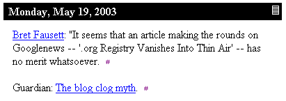
The HTML behind the above screenshot is as follows:
<table width="400" cellspacing="0" cellpadding="3" border="0">
	<tr bgcolor="#000000">
		<td colspan="2"><font color="#F5F5F5"> <b>Monday, May 19,
2003</b></font></td>
		<td valign="middle"><font color="#F5F5F5">
<b><a href="http://scriptingnews.userland.com/2003/05/19"
title="Permanent link to Scripting News archive for Monday, May 19, 2003.">
<img src="http://www.scripting.com/images/home/dailyLinkIcon.gif"
height="15" width="12" border="0"></a></b></font></td>
		</tr>
	<tr bgcolor="white">
		<td width="5"> </td>
		<td valign="top">
			<br>
			<a name="When:1:11:34PM">
<a href="http://icann.blog.us/2003/05/19.html#a1356">Bret Fausett</a>:
"It seems that an article making the rounds on Googlenews -- '.org Registry
Vanishes Into Thin Air'  -- has no merit whatsoever.
<a href="http://scriptingnews.userland.com/2003/05/19#When:1:11:34PM"
title="Permanent link to this item in archive.">
<img src="http://www.scripting.com/images/2001/09/20/sharpPermaLink3.gif"
height="9" width="6" border="0"></a><br><br>

<a name="When:7:06:28AM">Guardian:
<a href="http://www.guardian.co.uk/online/comment/story/0,12449,959151,00.html">
The blog clog myth</a>.
<a href="http://scriptingnews.userland.com/2003/05/19#When:7:06:28AM"
title="Permanent link to this item in archive."><img
src="http://www.scripting.com/images/2001/09/20/sharpPermaLink3.gif"
height="9" width="6" border="0"></a><br><br>
I’ve added some extra line breaks to fit all of the code in the space available, but other than that it’s unmodified.
First, let’s reduce the above to the equivalent structural HTML, removing all of the presentational tags and adding in a few that might be useful. We’re also going to remove the images—they’ll still be there in the final version, but by using background images defined in the CSS we can save quite a lot of code.
<div class="entry">
<h2><a href="http://scriptingnews.userland.com/2003/05/19"
title="Permanent link to Scripting News archive for Monday, May 19, 2003."
class="permalink"><span>#</span></a>Monday, May 19, 2003</h2>

<p><a name="When:1:11:34PM"></a>
<a href="http://icann.blog.us/2003/05/19.html#a1356">Bret Fausett</a>:
"It seems that an article making the rounds on Googlenews -- '.org Registry
Vanishes Into Thin Air' -- has no merit whatsoever.
<a href="http://scriptingnews.userland.com/2003/05/19#When:1:11:34PM"
title="Permanent link to this item in archive." class="permalink"><span>#</span></a></p>

<p><a name="When:7:06:28AM"></a>Guardian:
<a href="http://www.guardian.co.uk/online/comment/story/0,12449,959151,00.html">
The blog clog myth</a>.
<a href="http://scriptingnews.userland.com/2003/05/19#When:7:06:28AM"
title="Permanent link to this item in archive." class="permalink"><span>#</span></a></p>

</div>
A few notes about the above. First, I’ve wrapped the whole entry in a div with the class “entry”. This means I can use descendant selectors to style the other elements in the block qithout needing to add additional classes. The only classes I’ve added are the permalink classes on the various permalinks—these will be used in a moment. Note also that the ’#’ signs in the permalinks have a span tag around them. The reason for this will become apparent in a moment. The table used for the header has been replaced with a structural h2 tag. Header tags should be applied in order, with the most important header on the page using h1 and the other headers being used for sub headers, sub-sub headers and so on. I’m assuming that h1 would be used for the site title (or logo) so I’m using h2 in this example.
The unstyled HTML can be seen here.
Now let’s style it with some CSS. First up, Scripting.com’s main layout table is 400 pixels wide. We can emulate that by applying a width to our <div>:
div.entry {
  width: 400px;
}
Now let’s concentrate on the header. The date header on Scripting.com has a black background with white text. The text is bold, and is displayed at the same size as the body text of the rest of the site. In CSS, relative sizes can be specified using the em unit. 1em means 1 times the current text size, so we’ll set the font-size to 1em. Finally, the header is padded with about 3 pixels on every side. Here’s the CSS:
h2 {
  background-color: black;
  color: white;
  font-size: 1em;
  font-weight: bold;
  padding: 3px;
}
See the result here. So far, so good—but what about the funky permalink? It’s an image, and it appears over on the right. Normally this would be a sign that we need a table, but we can achieve the same effect in CSS using the float property. Floats are actually one of the hardest properties to fully understand, but if you’ve ever used the align attribute on an image you should have a good idea of what they do. We will use float: right on the permalink to cause it to shfit as far right as possible, appearing next to the main header text.
h2 a.permalink {
  float: right;
}
But what about the image? Here’s where things get tricky. We’re going to use a technique called the Fahrner Image Replacement. This is what the extra spans are for—we can apply a background image to the a element, then make the contents of the span invisible using display: none.
h2 a.permalink {
  float: right;
  width: 12px;
  height: 15px;
  background-image: url("dailyLinkIcon.gif");
}
h2 a.permalink span {
  display: none;
}
And here’s the result.
That’s the header finished—now for the paragraphs. The first thing to notice is that they are indented approximately 15 pixels on the left hand side. This can be easily emulated in CSS using either a margin or padding—I’ll use padding, but margin would work just fine as well.
div.entry p {
  padding-left: 15px;
}
We’re nearly finished—all that’s left to do now is the permalinks at the end of each paragraph. We will use FIR again, but this time the background image we are using is far smaller than the # sign it is replacing so we can take a slightly different approach:
div.entry p a.permalink {
  background: #fff url("sharpPermaLink.gif") no-repeat center center;
  text-decoration: none;
}
div.entry p a.permalink span {
  visibility: hidden;
}
This time the permalink is made invisible using the visiblility property rather than being removed entirely—that way we don’t have to worry about adding a width or height to the link. The background image is placed using a shorthand property which allows all of the background properties to be specified at once—it should be relatively clear what the property does.
The end result can be seen here—viewed in a standards compliant browser (I tried it in Firebird, IE 5 and Opera 7) I think you’ll agree it’s an almost exact replica of the original, but with a great deal less markup. Times that saving by several dozen entries on a page and it really starts to add up.
Final note: this entry comes with apologies to Dave Winer of scripting.com, who has not been consulted prior to the publication of the article.
More recent articles
- Weeknotes: Llama 3, AI for Data Journalism, llm-evals and datasette-secrets - 23rd April 2024
- Options for accessing Llama 3 from the terminal using LLM - 22nd April 2024
- AI for Data Journalism: demonstrating what we can do with this stuff right now - 17th April 2024
- Three major LLM releases in 24 hours (plus weeknotes) - 10th April 2024
- Building files-to-prompt entirely using Claude 3 Opus - 8th April 2024
- Running OCR against PDFs and images directly in your browser - 30th March 2024
- llm cmd undo last git commit - a new plugin for LLM - 26th March 2024
- Building and testing C extensions for SQLite with ChatGPT Code Interpreter - 23rd March 2024
- Claude and ChatGPT for ad-hoc sidequests - 22nd March 2024
- Weeknotes: the aftermath of NICAR - 16th March 2024